BRON Kombucha
design by Sarah
Scope: identity and label design
Client: Natalie of ELDER Lab
Year: 2020–
︎︎︎ bronkombucha.be
design by Sarah
Scope: identity and label design
Client: Natalie of ELDER Lab
Year: 2020–
︎︎︎ bronkombucha.be
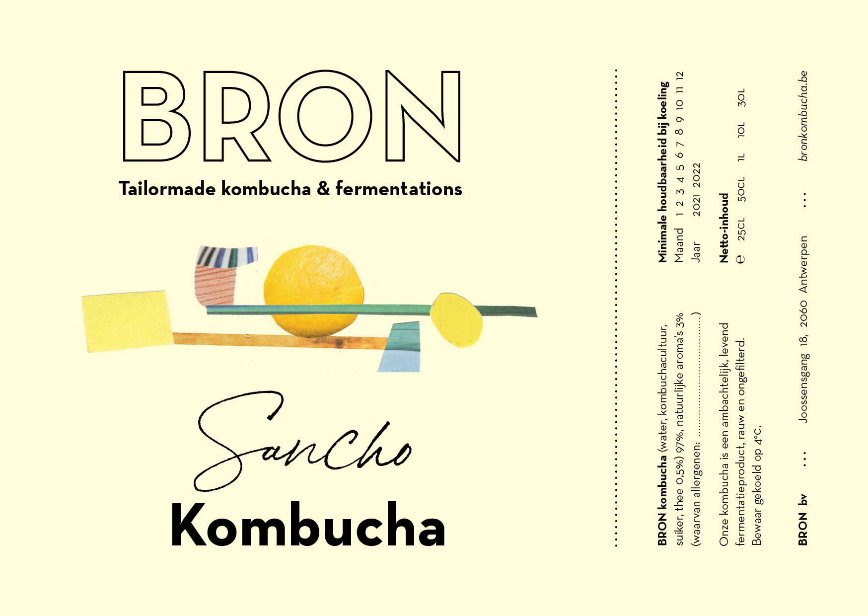
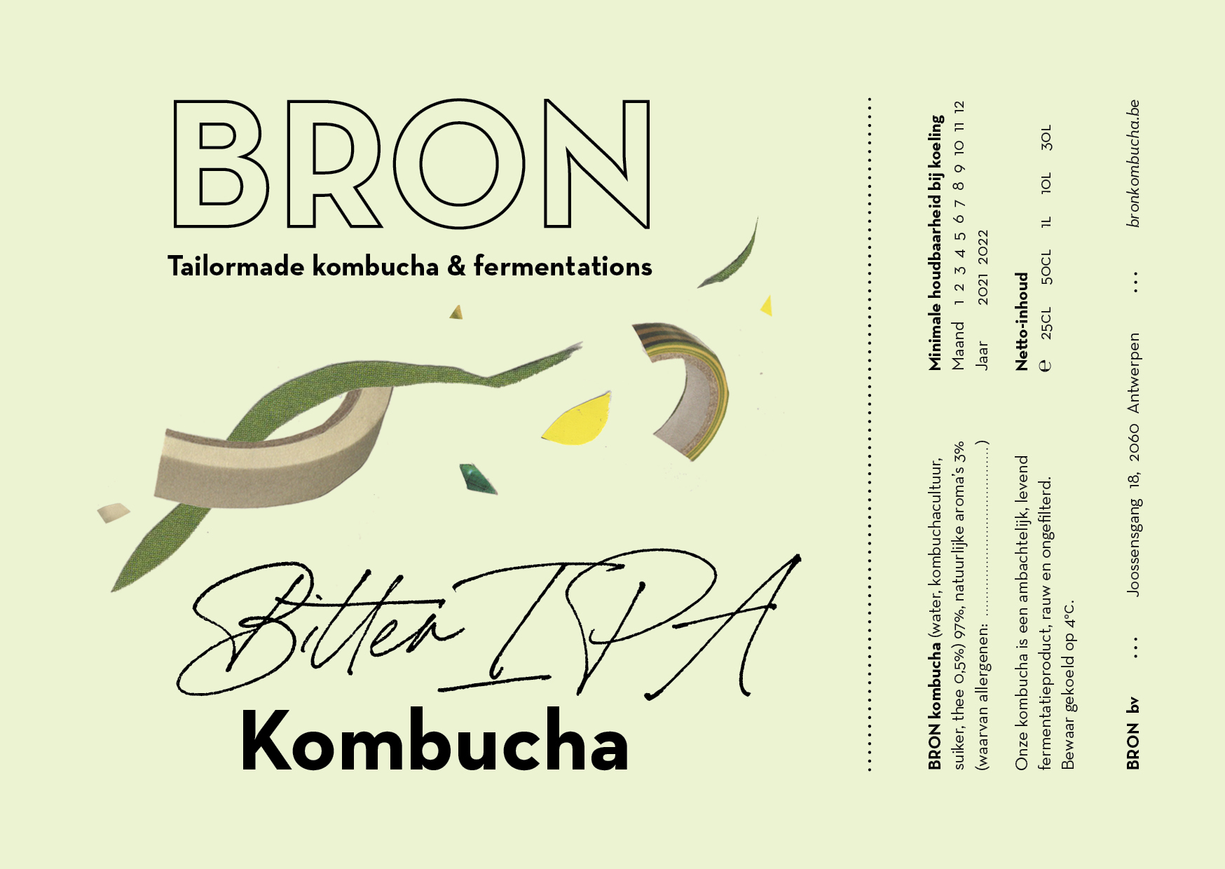
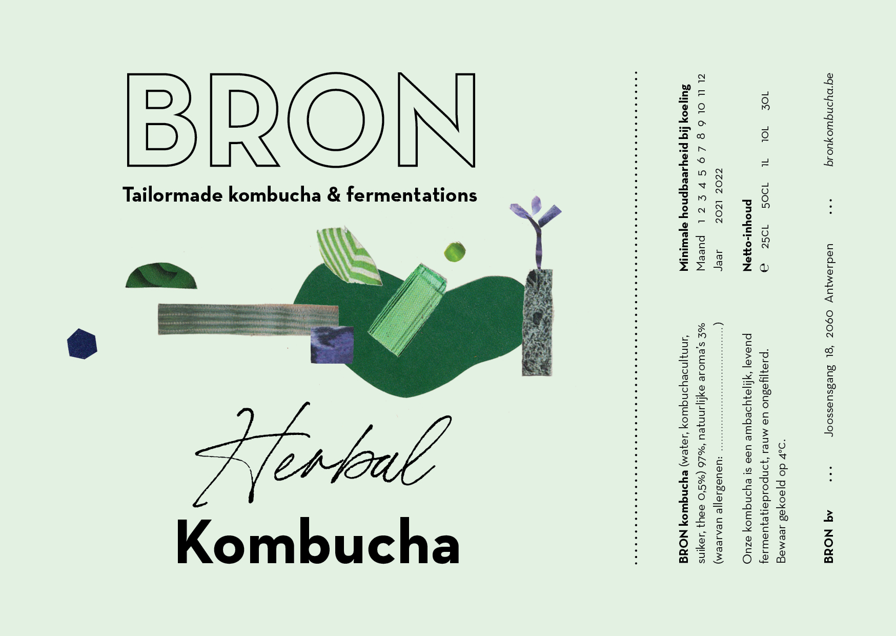
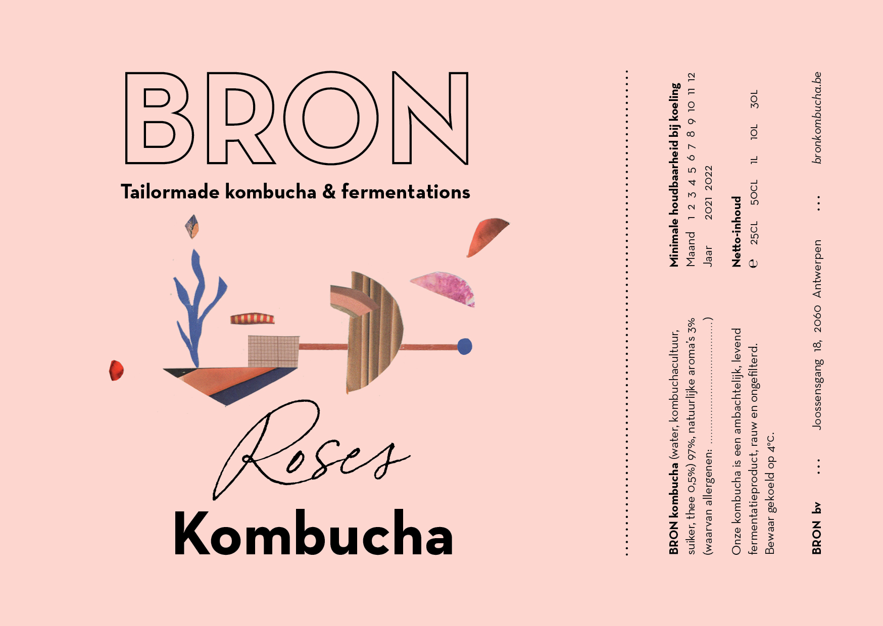
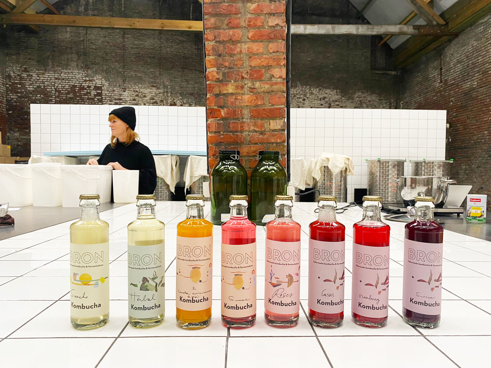
Design of the logo, color palette, website and labels for the start-up BRON Kombucha. Since January 2020, BRON has been working as a craft microbrewery in the North of Antwerp, brewing on a high-quality, unpasteurized and sprightly kombucha with a lot of body and flavour. They work with high quality seasonal and local ingredients The flavours vary per season and are based on (medicinal) herbs and spices, without the addition of fruit juices.
We created a color palette that represents the various flavours: grassy, forest, sea, berry, floral, wood, citrus, fresh and clean. The bottle labels use these colour as pastel shades and are complemented by Hannelore Dreher’s delicate collages. We are also currently working on a design for a commercial and pasteurized variety of BRON Kombucha that will be available in stores.
We created a color palette that represents the various flavours: grassy, forest, sea, berry, floral, wood, citrus, fresh and clean. The bottle labels use these colour as pastel shades and are complemented by Hannelore Dreher’s delicate collages. We are also currently working on a design for a commercial and pasteurized variety of BRON Kombucha that will be available in stores.