SUSTAINABILITY AS A MINDSET
Sustainability is an important aspect in our lives. We live consciously by having a small home, consuming and wasting little, buying second hand, renovating in an environmentally-friendly way, eating vegan, growing our own vegetables, shopping local and seasonal, etc. We uphold these same values in our professional life.
As book designers, our impact can be reduced by designing thoughtfully, choosing appropriate materials, using the right production method for each individual project and working with like-minded suppliers. A beautiful and well-made book is one you want to hold lovingly, read multiple times, and cherish for a long while. We’re here to help (self-)publishers with every step in this process.
Additionally, our shared office space Howdy is an accumulation of our growing interest in bio-ecological renovation, the knowledge we acquired through years of research (especially thanks to the extensive database of our local supplier Ecomat) and a strong DIY ethos. Our aim is to show people the possibilities of an eco-friendly and sustainable renovation. Not only did we use a wide variety of ecological, healthy materials, the interior is almost completely made up of second-hand furniture and appliances.
In this case study we will give some examples of recent work where sustainable choices were at the forefront.


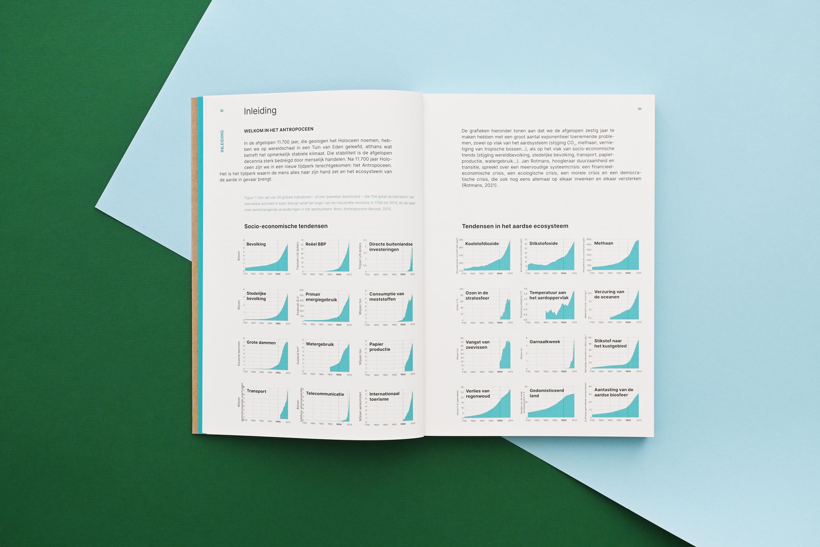
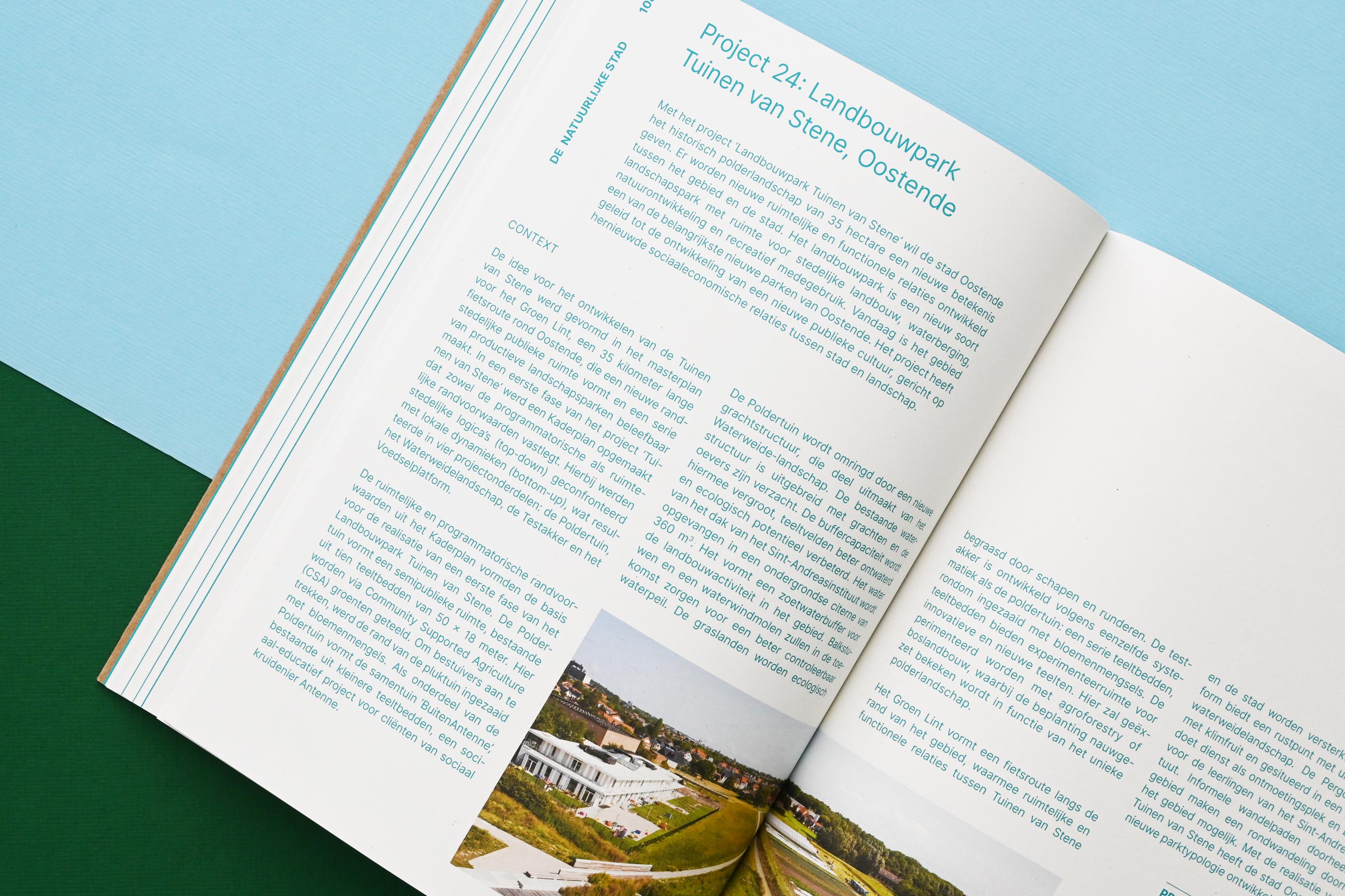
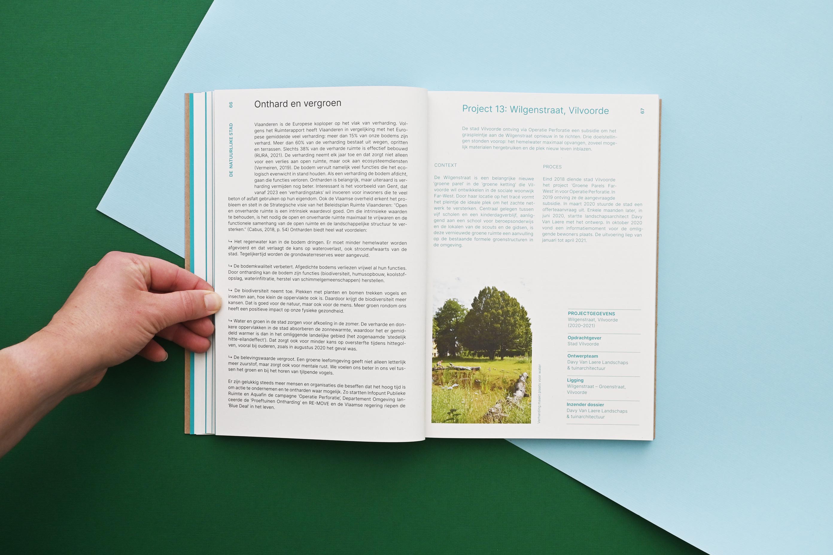
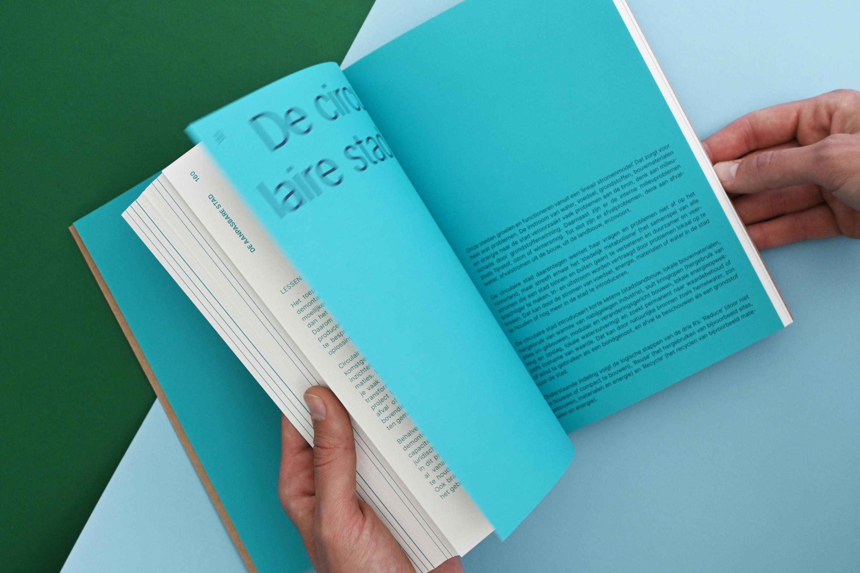
STEDENBOUW KAN OOK ZO (loosely translated: Urban planning can also be approached like this) features useful tips and 57 projects that offer an alternative and future-proof approach to urban planning. It was crowdfunded, making it easier to calculate the amount of books that needed to be printed, and co-created by civil society organisations, authors, experts, engineering offices and municipalities. A true collaborative effort!
We used a space-efficient design by laying out the subchapters continuously and avoiding unnecessary blank pages. The PMS colour was used to separate the informational texts from the project texts. We avoided bleeding images off the pages in order to have as little printed paper waste as possible: this requires less energy to recycle. The inside pages of the book were printed on Cyclus Offset 115gr (100% post-consumer recycled*, certifications: Blue Angel, EU-Ecolabel, Cradle to Cradle Certified®, ISO 14001, FSC® 100% Recycled, Nordic Swan – features: process chlorine free) in offset (CMYK with 1 PMS).
The softcover with flaps was printed in offset (1 PMS) on Muskat Brown 290gr (100% recycled – certifications: FSC® Recycled). We chose this material because its natural look and feel are a good match with the subject matter and with the interior paper.
Stedenbouw kan ook zo was expertly edited by Eva Heuts of VIBE vzw, Erik Grietens of Bond Beter Leefmilieu and Joeri De Bruyn of the publisher Public Space. It was printed by Die Keure, world-renowned for its qualitative and sustainable printing.
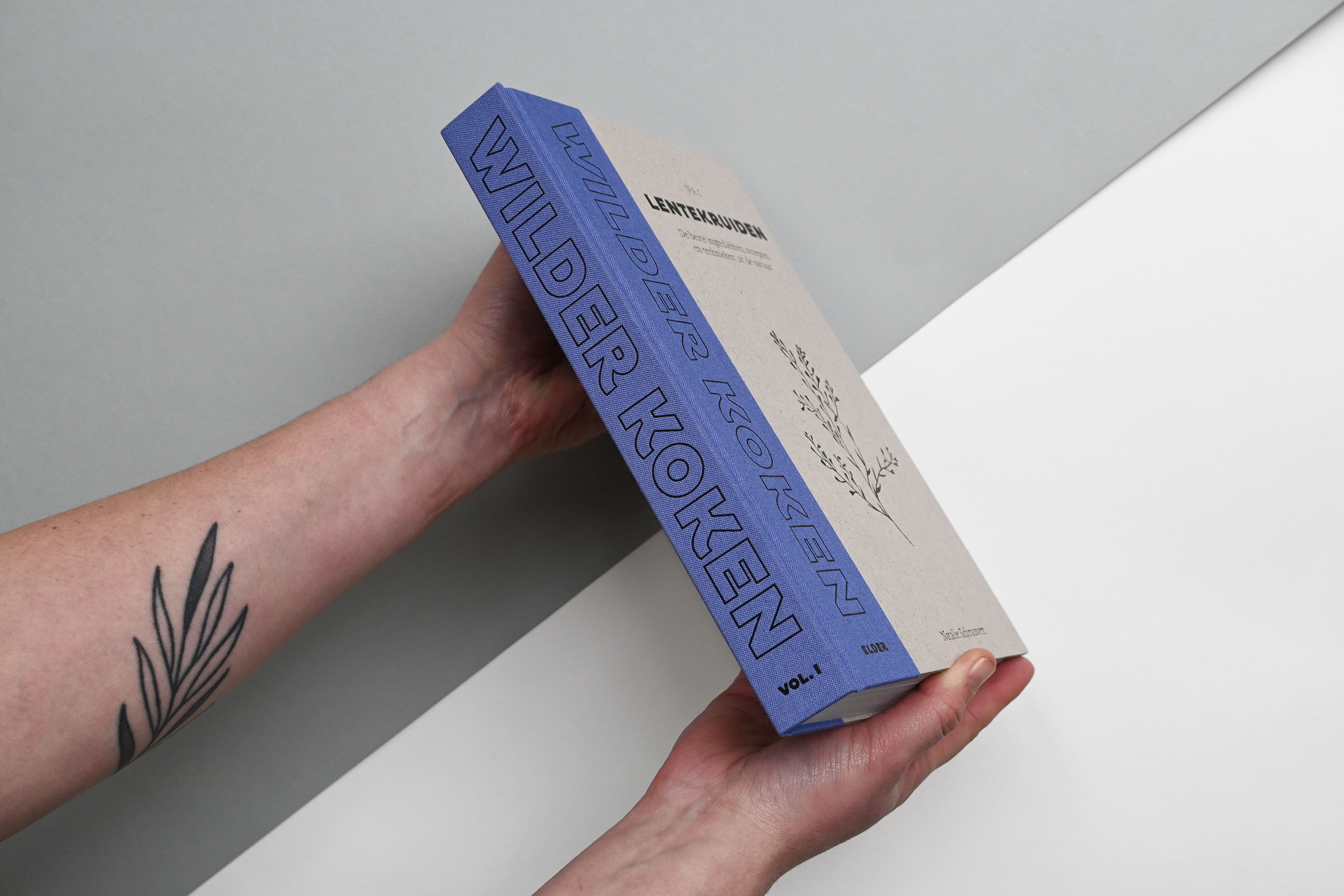
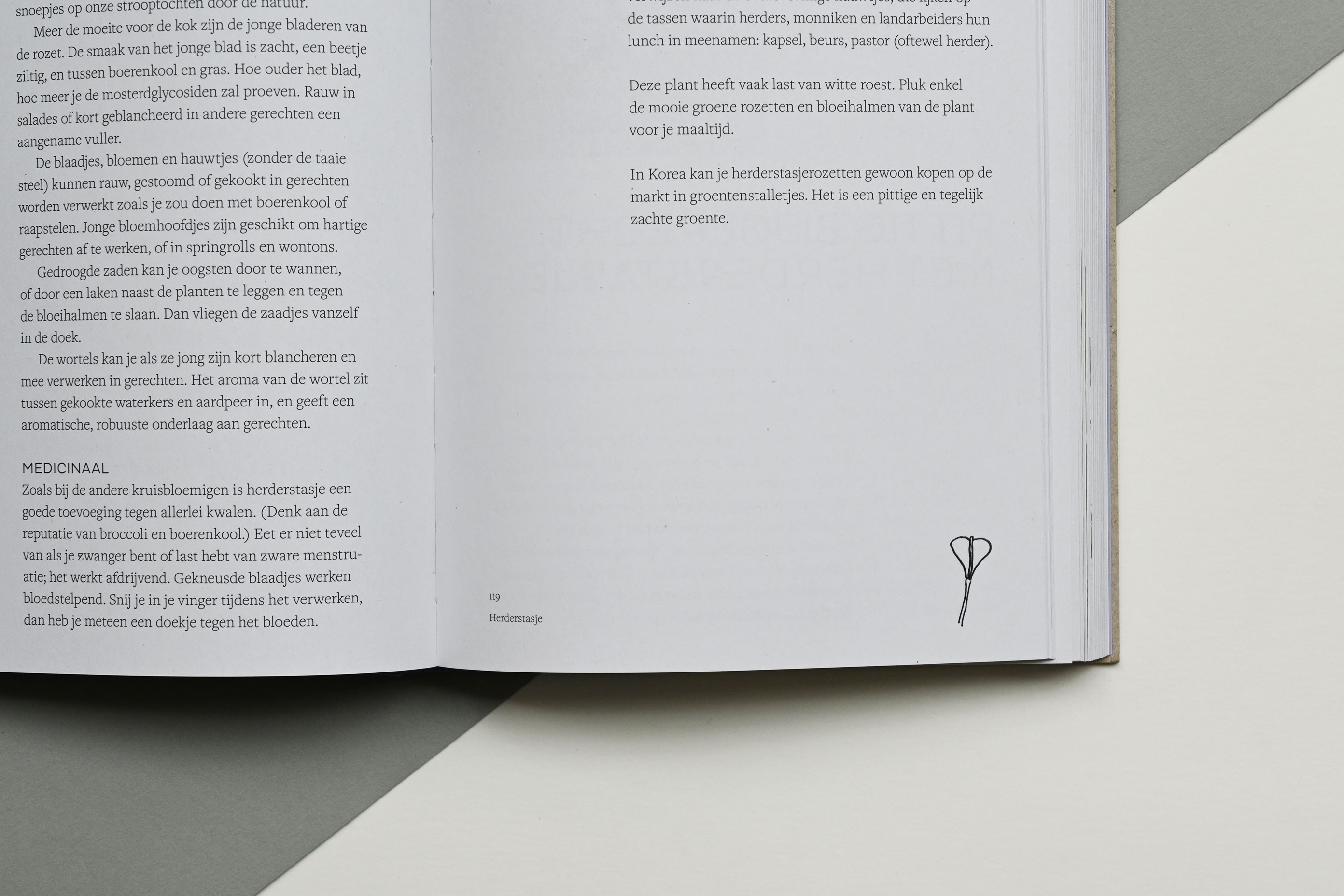
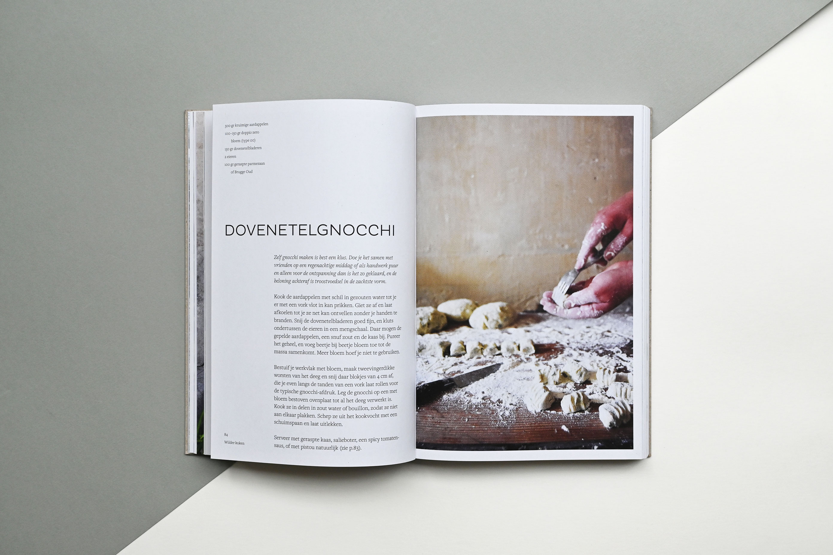
WILDER KOKEN (loosely translated as Cooking wilder) is the first book in a series on how to forage and cook like a pro, self-published by herbalist and chef Natalie Schrauwen, a.k.a. ELDER. Volume I – Lentekruiden (Spring herbs) features 24 recognisable wild spring plants with vibrant pictures, yummy recipes and a whole lot of practical info.
The interior pages are printed in offset (CMYK) on Nautilus Classic White 100gr (100% post-consumer recycled – certifications: Blue Angel, EU-Ecolabel, Cradle to Cradle Certified®, ISO 14001, FSC® 100% Recycled – features: process chlorine free). The sewing was done with an innovative multicolour thread, which makes each centre section and each book unique.
Some printers or clients might be hesitant about printing on the slightly grey, uncoated and clearly recycled Nautilus. We worked together brilliantly with L.capitan by brightening the photo files and adjusting the presses, and are very happy with the results. The photographs came out in stunning yet natural colours.
The book was quarter bound by Brepols with a lavender-coloured Wicotex Brillianta linen (dyed woven viscose cloth which is laminated to acid-free lining paper). It is REACH compliant (a regulation of the EU that protects human health and the environment from the risks that can be posed by chemicals) and vegan. The greyboard for the hardcover is left exposed (without a covering material such as linen or paper), minimizing the amount of materials, glues and processes used. The front cover and spine are foil stamped instead of printed.


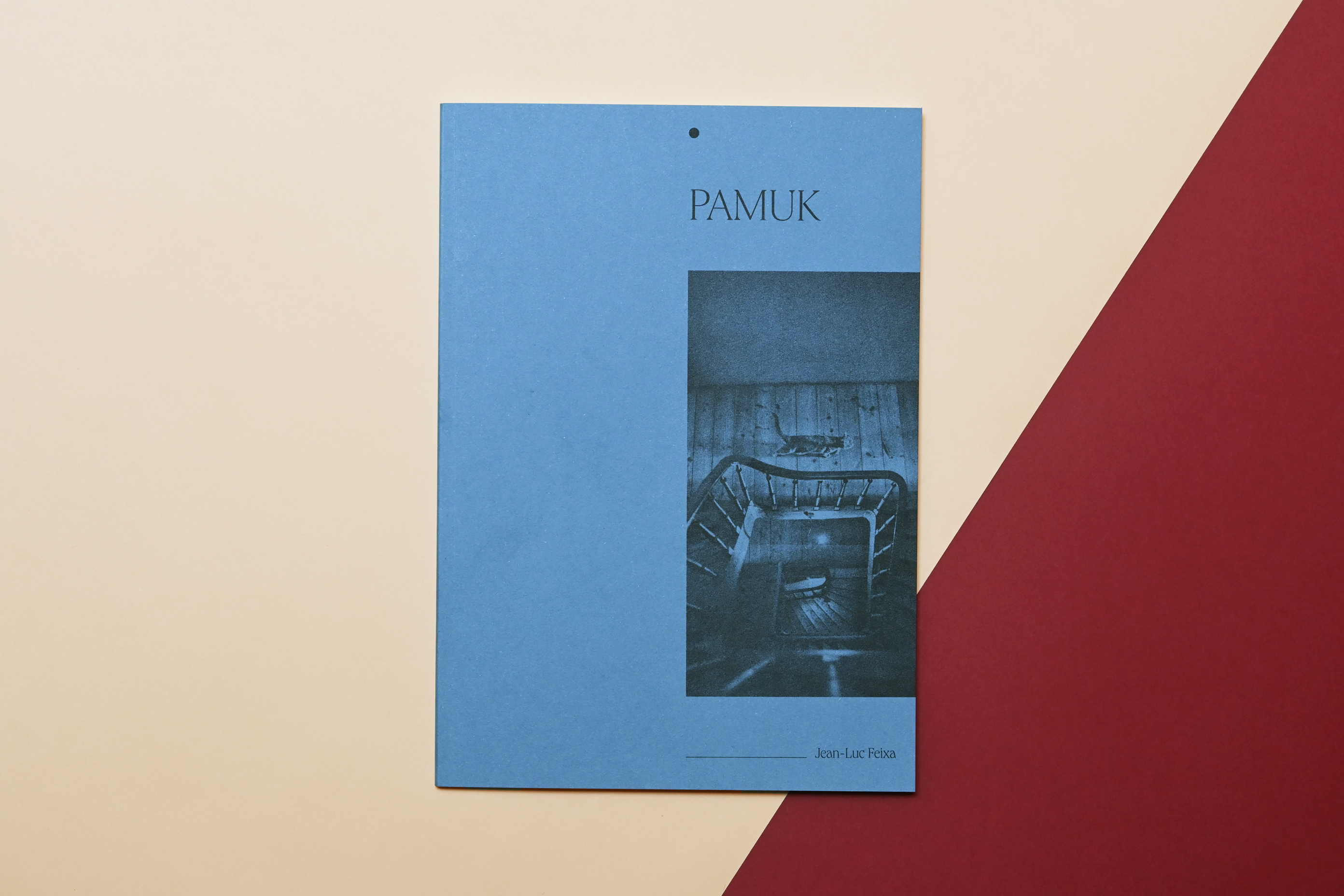

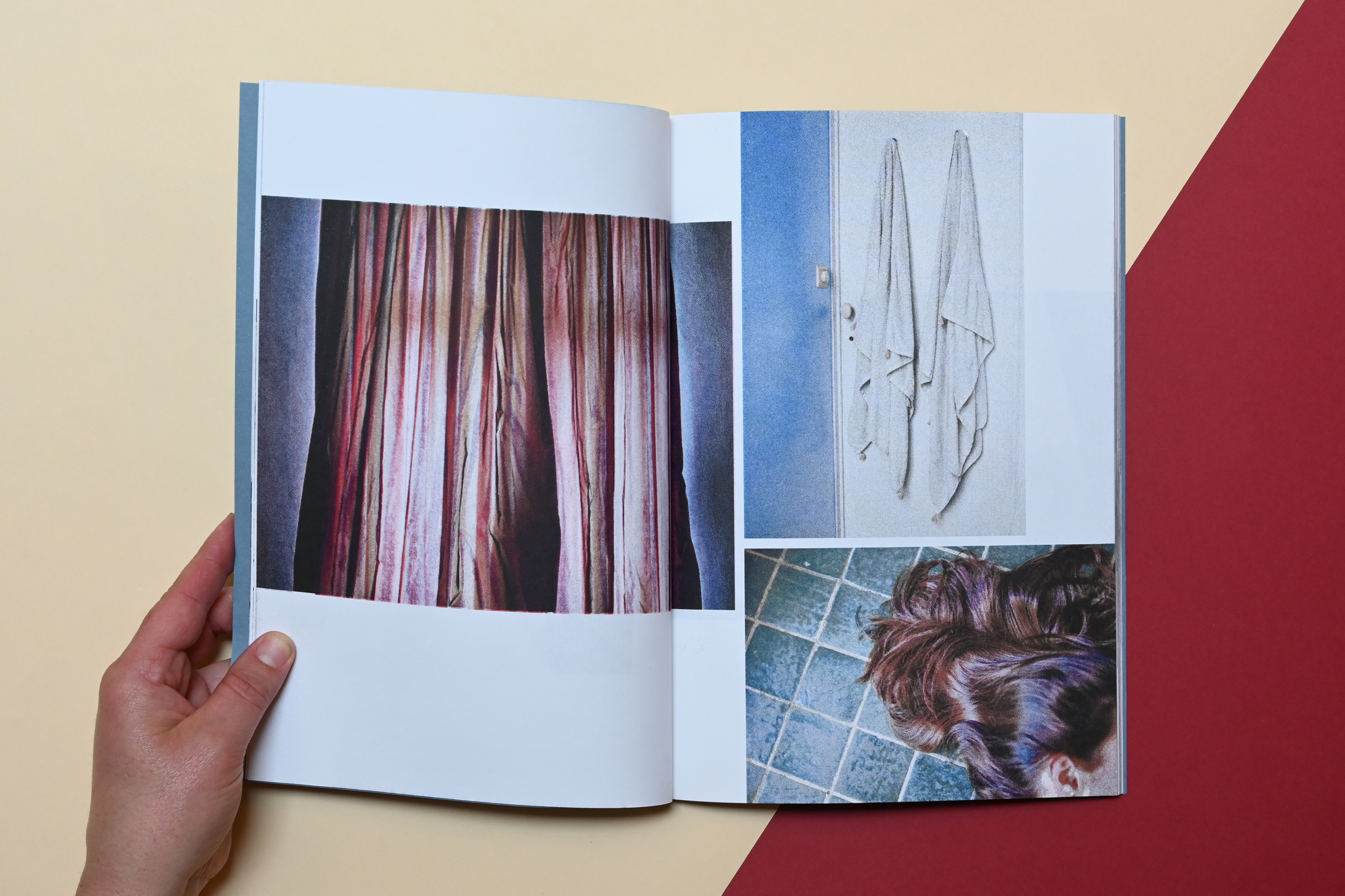
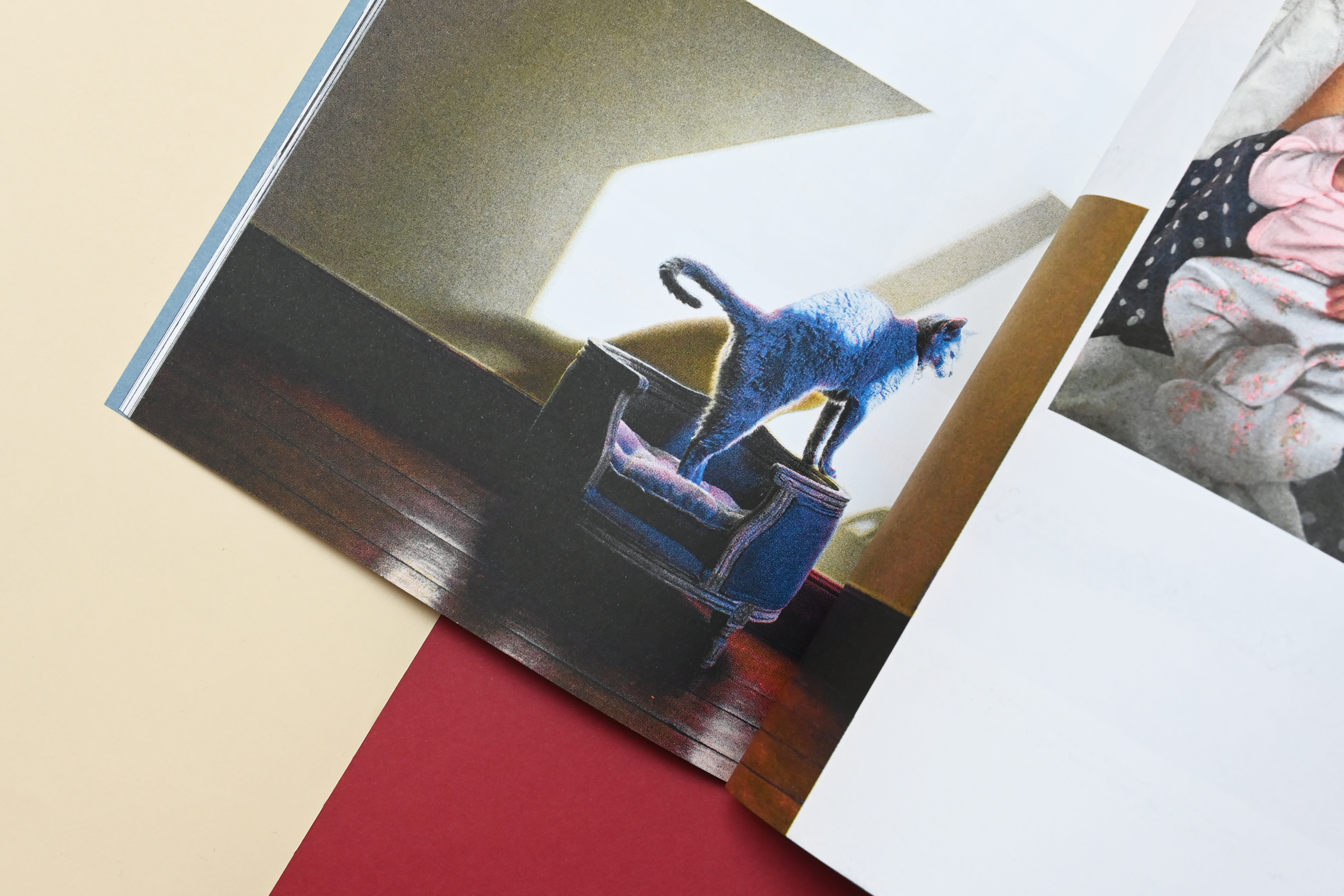


PAMUK is a four-season visual notebook by photographer Jean-Luc Feixa. His eponymous cat leads the way in his new house. Whether she is enjoying a gentle ray of sunshine, hunting on the emerald green tiles or lounging in a sky full of stars, she shows off her grey coat with ease through every corner of this new universe.
Feixa usually takes analogue, grainy and black-and-white photographs, but for this series he used a digital camera. The four-colour photographs stand out from his portfolio, so when he approached us to make a book, we wanted to incorporate some of the analogue aesthetic. We immediately thought of RISO printing, a technique that we have also used in our own work.
A risograph printer is a machine that prints copies of digital files, using automated techniques of screenprinting and mimeograph, merging the digital with the analogue. The machine prints one or two colours at a time. They use 75–95% less energy than regular photocopiers (depending on the model), the inks are made from rice bran (a raw waste material), the ink cartridges are recycled and the master sheets use rice paper (a biodegradable material). Unlike toner-based printers, RISO machines don’t emit greenhouse gases or VOCs (Volatile Organic Compounds).
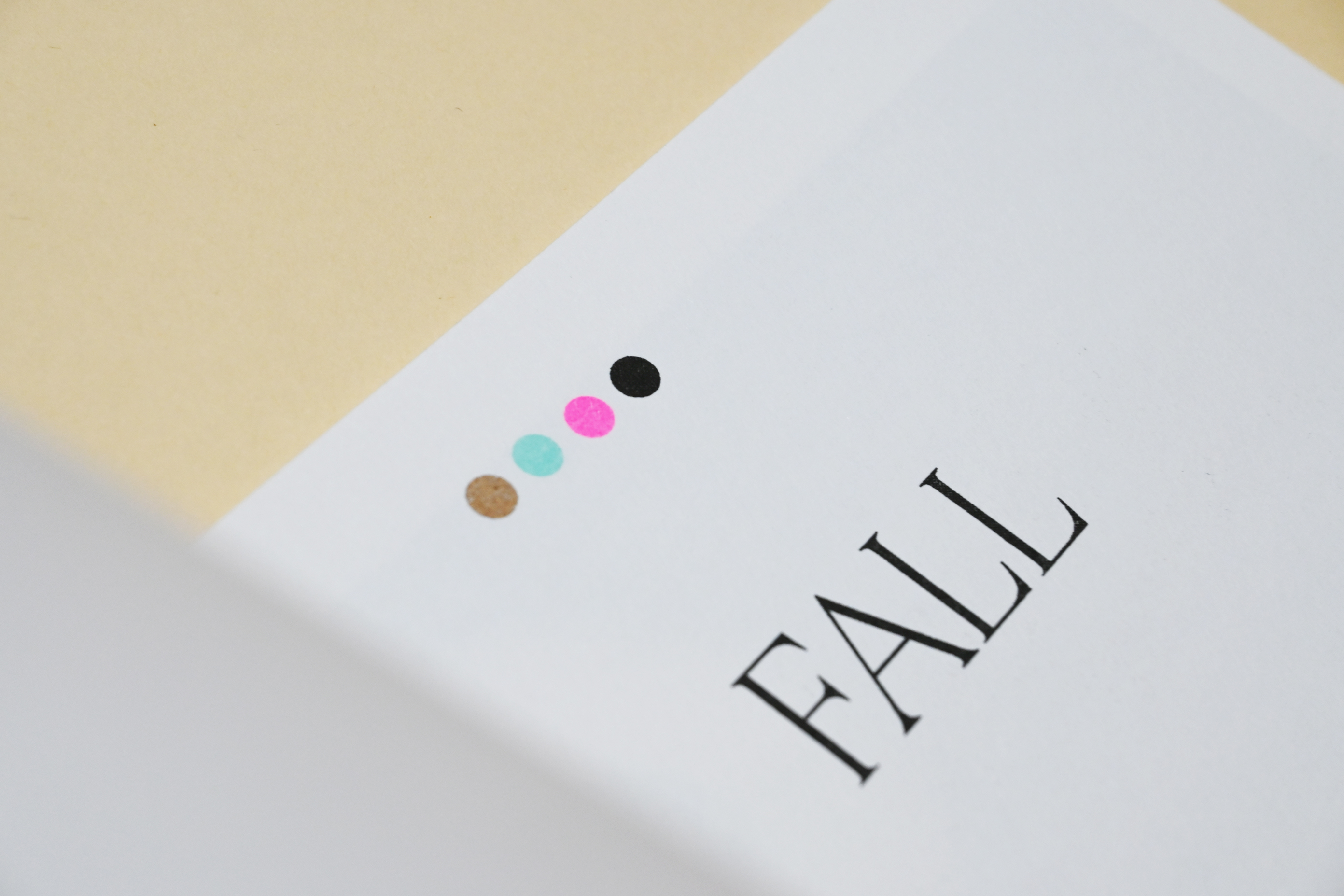
Nina Serebrenick of Studio Boekenberg meticulously printed the four sections of this book with four different colour combinations. This gives each chapter its own feel. The colour combinations are shown on the chapter openers: winter (metallic gold, bright red, blue and black), spring (aqua, yellow, black and fluorescent pink), summer (yellow, fluorescent orange, blue and black) and fall (metallic gold, aqua, fluorescent pink and black). Nina advised us on the correct order to print the colours, as some of them are more opaque and others more transparent. Fun fact: Nina’s printer ran entirely on solar energy during the sunny week that she spent printing it!
The interior pages are printed on Fedrigoni Freelife Cento Rough (100% recycled – certifications: FSC® 100% Recycled – features: acid free, heavy metal absence, select secondary fibres, biodegradable and recyclable) in four sections, according to the four seasons, with four different RISO inks each. This gives a specific look to each chapter.
The cover is printed on Fedrigoni Materica Acqua (certifications: FSC® Mix – features: cotton content, elemental chlorine free, acid free, select secondary fibres, heavy metal absence) made with 25% recycled fibres, 65% virgin fibres and 10% cotton fibres.
The limited run of books was bound by Gazelle.
Feixa usually takes analogue, grainy and black-and-white photographs, but for this series he used a digital camera. The four-colour photographs stand out from his portfolio, so when he approached us to make a book, we wanted to incorporate some of the analogue aesthetic. We immediately thought of RISO printing, a technique that we have also used in our own work.
A risograph printer is a machine that prints copies of digital files, using automated techniques of screenprinting and mimeograph, merging the digital with the analogue. The machine prints one or two colours at a time. They use 75–95% less energy than regular photocopiers (depending on the model), the inks are made from rice bran (a raw waste material), the ink cartridges are recycled and the master sheets use rice paper (a biodegradable material). Unlike toner-based printers, RISO machines don’t emit greenhouse gases or VOCs (Volatile Organic Compounds).
Nina Serebrenick of Studio Boekenberg meticulously printed the four sections of this book with four different colour combinations. This gives each chapter its own feel. The colour combinations are shown on the chapter openers: winter (metallic gold, bright red, blue and black), spring (aqua, yellow, black and fluorescent pink), summer (yellow, fluorescent orange, blue and black) and fall (metallic gold, aqua, fluorescent pink and black). Nina advised us on the correct order to print the colours, as some of them are more opaque and others more transparent. Fun fact: Nina’s printer ran entirely on solar energy during the sunny week that she spent printing it!
The interior pages are printed on Fedrigoni Freelife Cento Rough (100% recycled – certifications: FSC® 100% Recycled – features: acid free, heavy metal absence, select secondary fibres, biodegradable and recyclable) in four sections, according to the four seasons, with four different RISO inks each. This gives a specific look to each chapter.
The cover is printed on Fedrigoni Materica Acqua (certifications: FSC® Mix – features: cotton content, elemental chlorine free, acid free, select secondary fibres, heavy metal absence) made with 25% recycled fibres, 65% virgin fibres and 10% cotton fibres.
The limited run of books was bound by Gazelle.
Do you want to know more about this subject or are you interested in collaborating on a sustainable project? Contact us!