THE CONTENT MAKES THE DESIGN
One of the things we love about book design is that we are exposed to a new subject matter with each project we work on. We have made books about art, plants, food, fashion, architecture, Shakespeare, travelling, bees, hiking, forest cabins, meditation, nuns, interior design, politics, health…
We believe that content is the beating heart of book design, forming the basis for our choices in the creative process: from the page flow and the use of type and colour, to the book size, materials and binding method. We aim to understand the nuances of the content to create a balance between form and functionality, between design and readability. A book should be an experience for the reader, so we hope to leave a lasting impression.
With attention to detail, we organize the flow of a book through a process of curation and editing. There should be an interplay of rhythm and structure that provides both clarity and a captivating yet natural reading experience.
The physical aspects of a publication – size, materials and binding – are more often than not informed by the content. We carefully choose dimensions that optimize content presentation, striking a balance between legibility and aesthetic appeal. Every book deserves a size that showcases its unique qualities and draws readers in. Materials are carefully curated to enhance the tactile experience and create a sensory connection with the content. We explore a wide range of weights, textures, and finishes to find the perfect match that complements the essence of the book (and the available budget). Binding is the glue that brings it all together. We select binding methods that align with the content, whether it’s a sturdy hardcover that exudes elegance and lies completely flat, or a flexible paperback that invites readers to curl up and delve into the story.
In this case study we give some examples of work where there is a clear link between the content and the design.

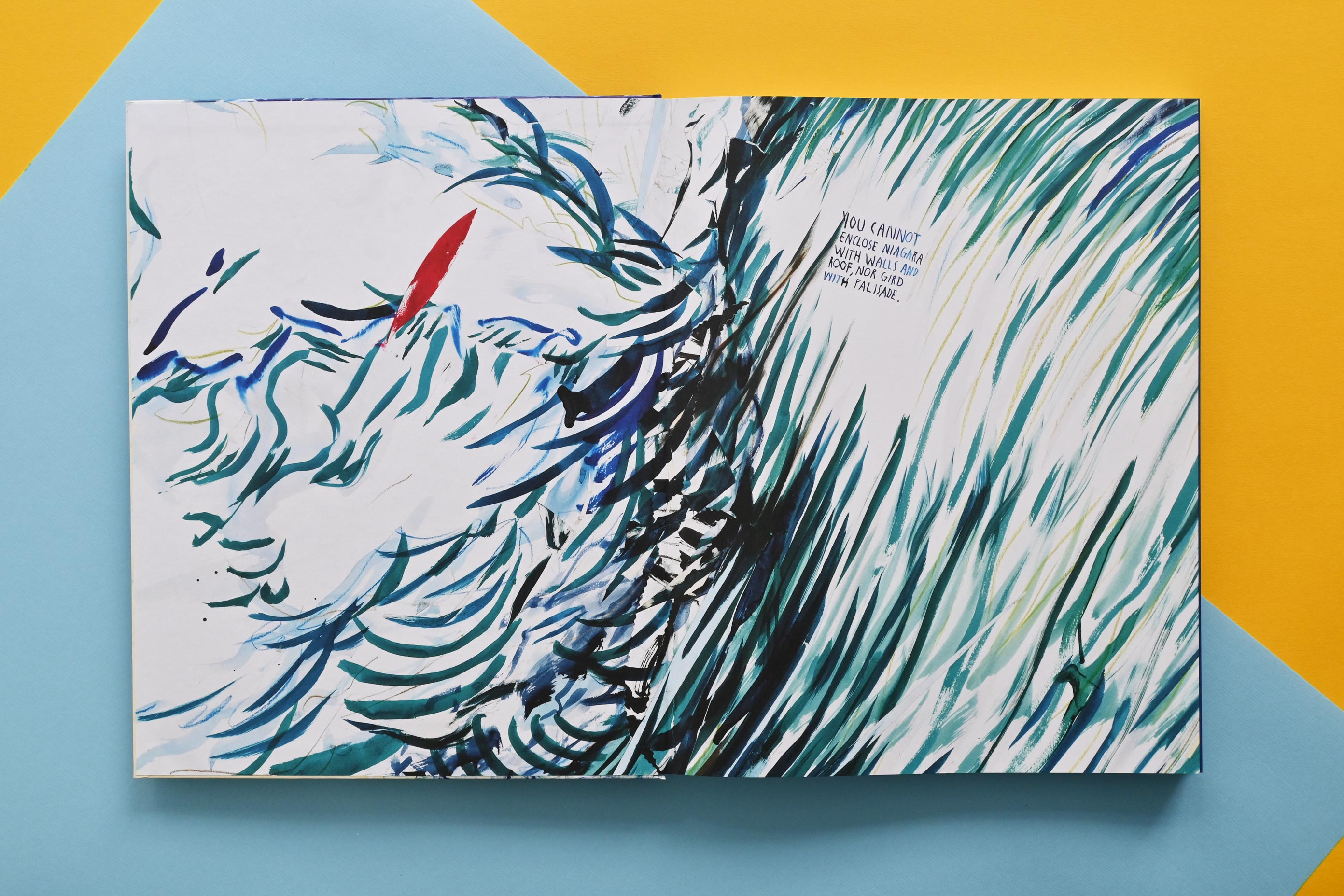


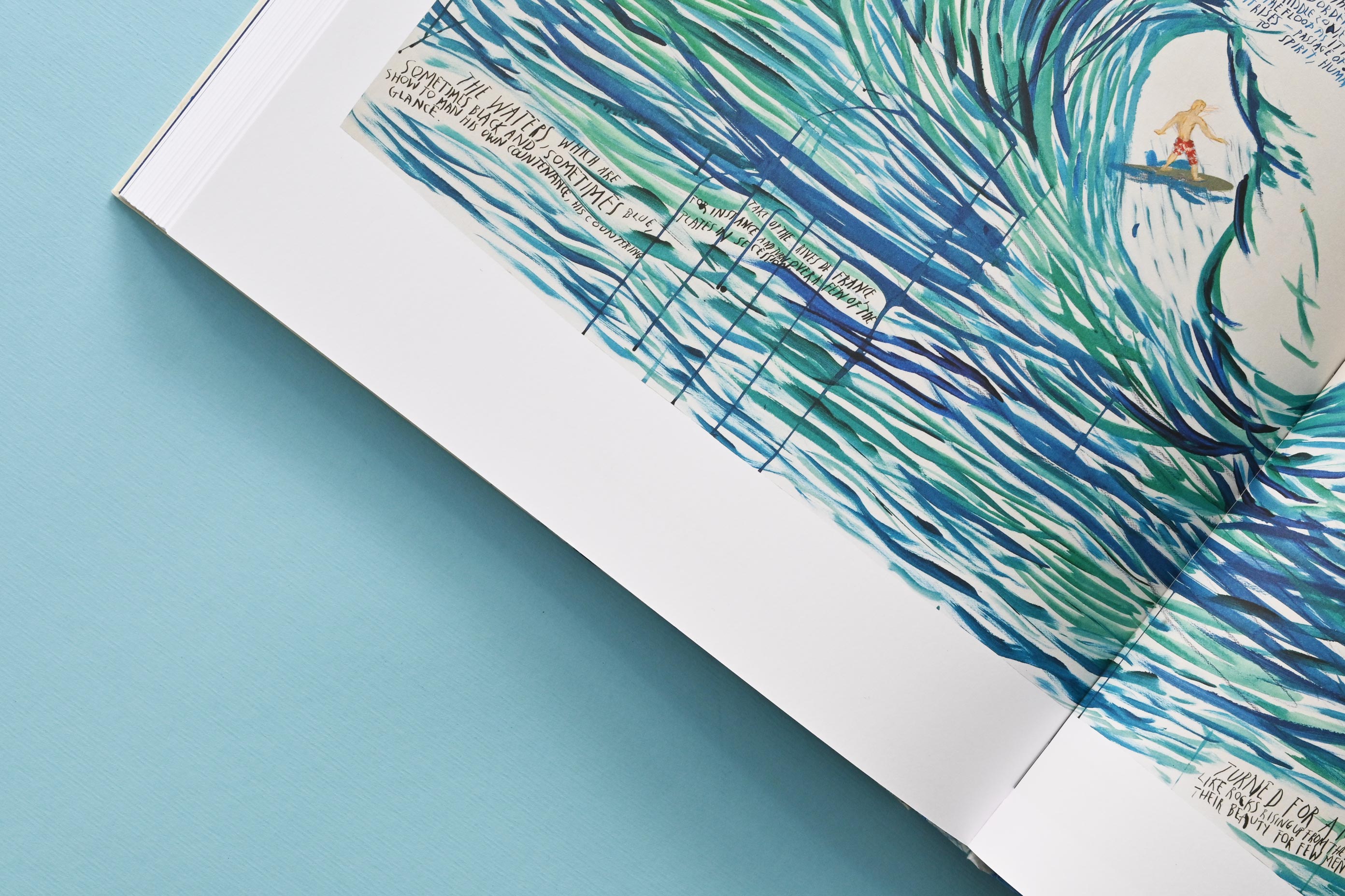

POINT BREAK–SURFERS AND WAVES is a coffee-table art book about American artist Raymond Pettibon. In 1985, Pettibon began his series of artworks featuring surfers and waves: from smaller monochromatic works on paper to colourful large-scale paintings applied directly to the wall, often depicting a lone surfer silently carving ‘a line of beauty’ along an impossibly large wave. We are forced to confront our own scale: small and feeble in the face of the power of nature, what is beyond our control.
This is why we chose a large format for the book: 305×229 mm. It’s a weighty object that compels you to take the time to sit down, open it up on your lap, and flip through the large pages admiring the artworks and imagining them at the size of your living room wall.
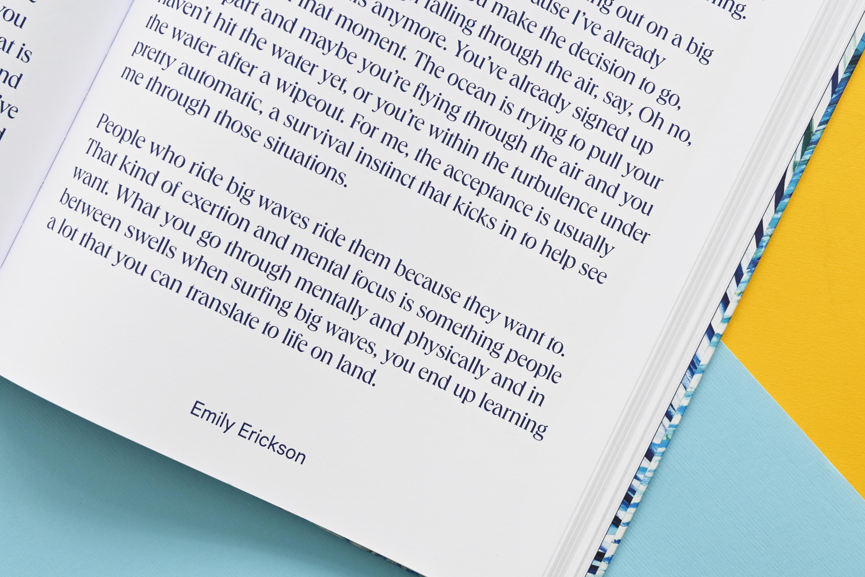
Bigger and smaller artworks alternate in a natural page flow. For the large titles, we chose an elegant font with details reminiscent of the waves. Main essay texts are clearly distinguished from the ‘testimonials’ by a different type and size treatment. The end papers feature close-up details from two artworks portraying the lone surfer experiencing the waves’ turbulence.
This is why we chose a large format for the book: 305×229 mm. It’s a weighty object that compels you to take the time to sit down, open it up on your lap, and flip through the large pages admiring the artworks and imagining them at the size of your living room wall.
Bigger and smaller artworks alternate in a natural page flow. For the large titles, we chose an elegant font with details reminiscent of the waves. Main essay texts are clearly distinguished from the ‘testimonials’ by a different type and size treatment. The end papers feature close-up details from two artworks portraying the lone surfer experiencing the waves’ turbulence.
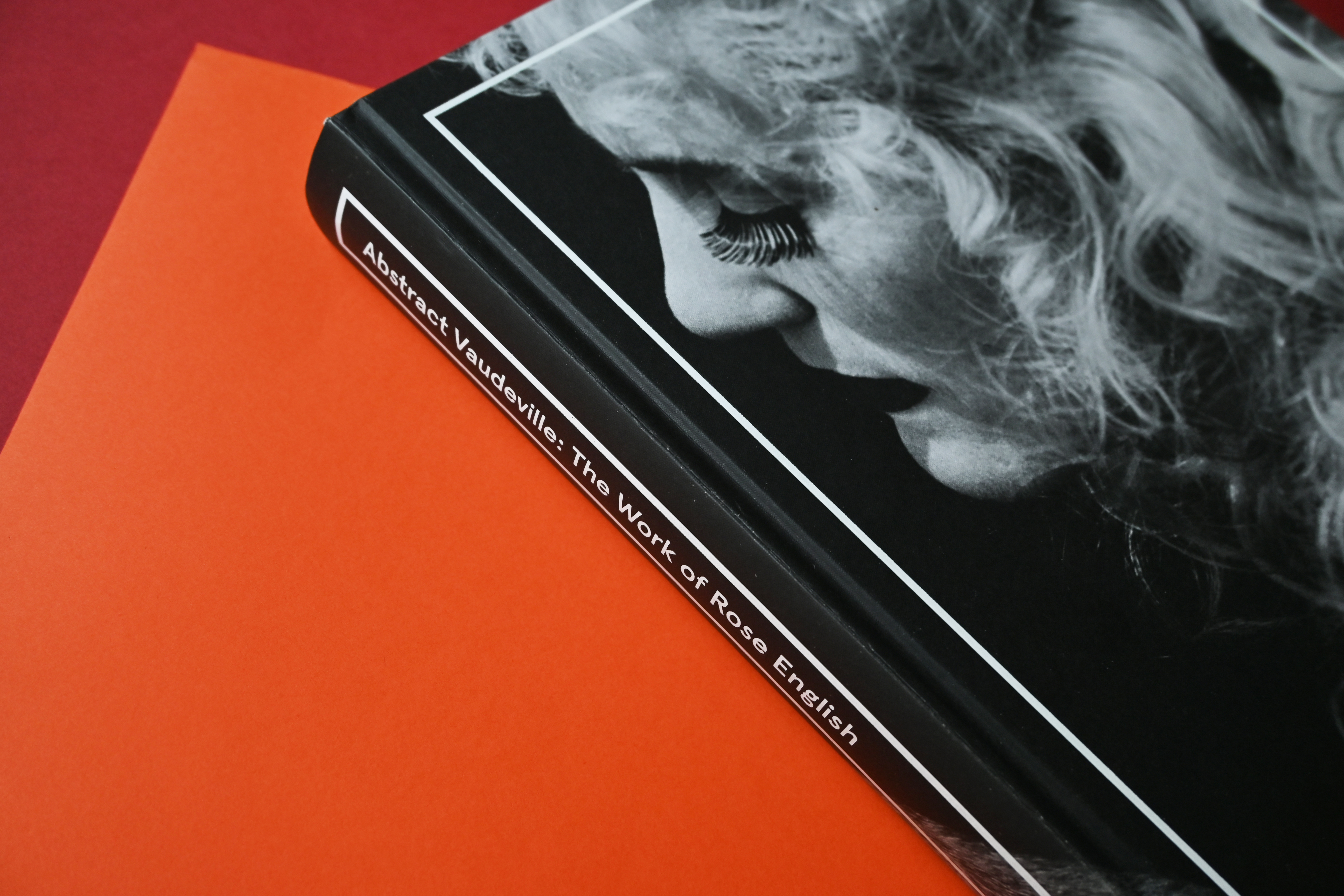
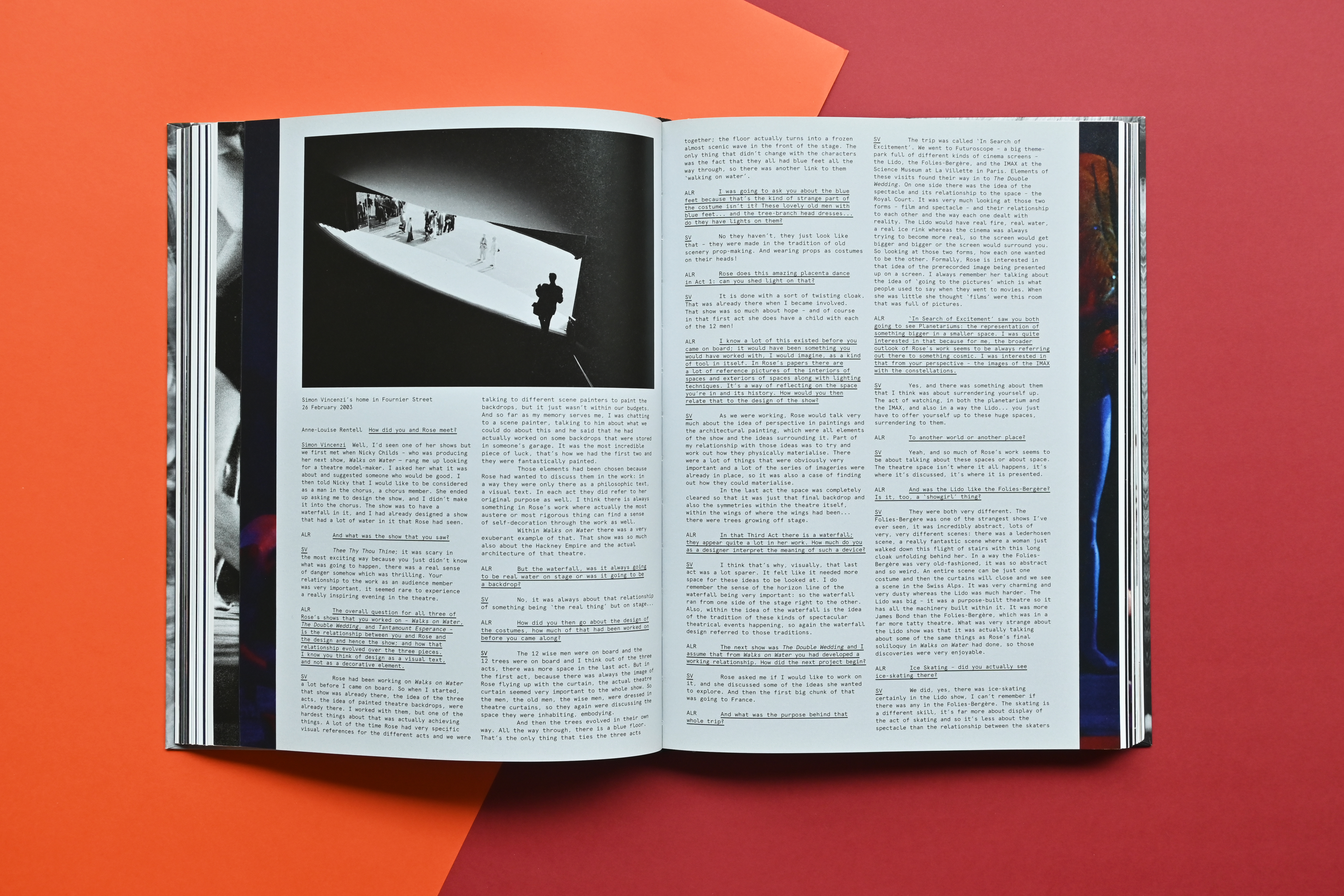
ABSTRACT VAUDEVILLE is the comprehensive monograph documenting the 40-year career of British performance artist Rose English. Her uniquely interdisciplinary work combines elements of theatre, circus, opera and poetry to explore themes of gender politics, the identity of the performer and the metaphysics of presence.
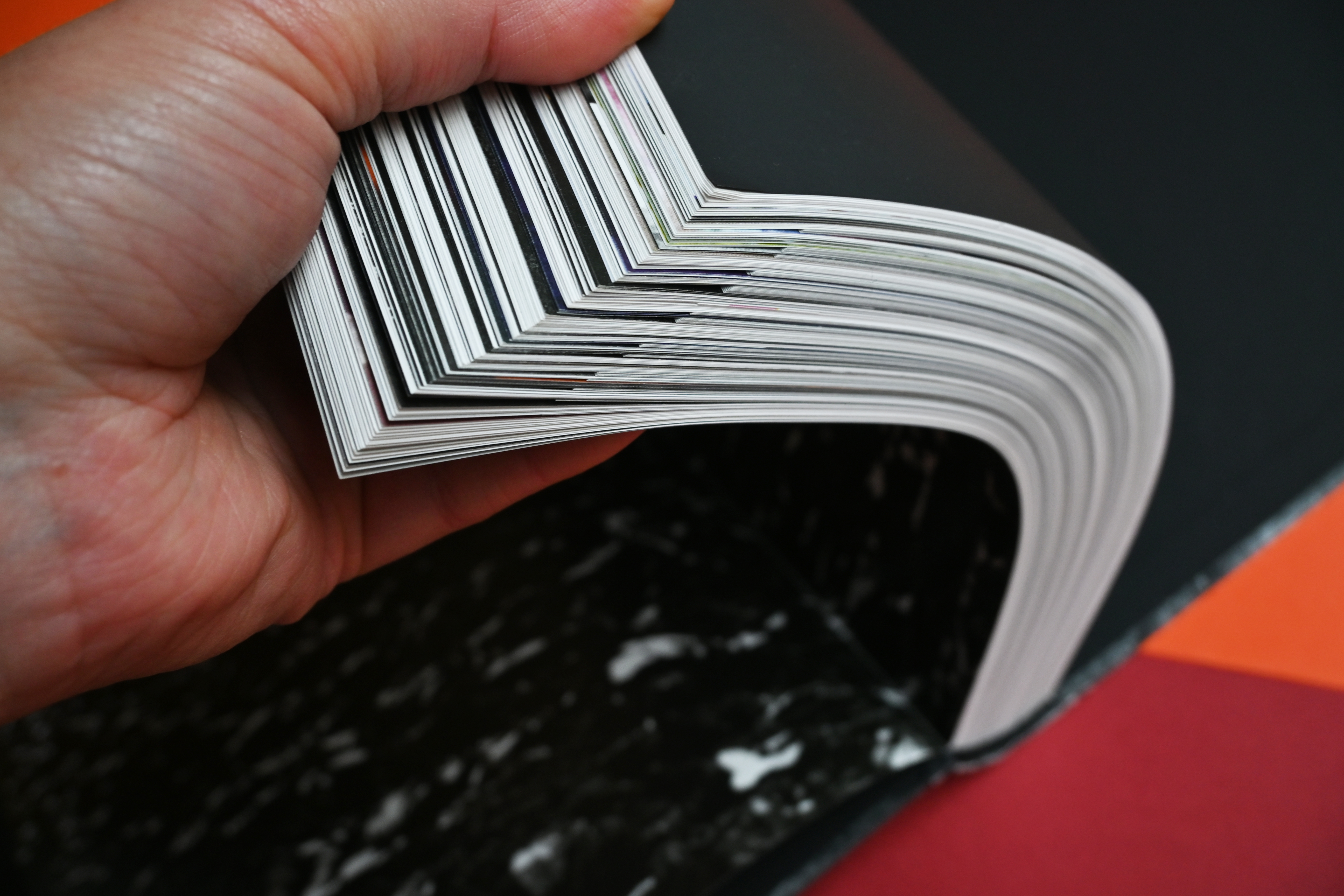
This was Sarah’s first project as an independent book designer, and she was approached by the book’s editor to tackle the challenge of intertwining the extensive essay with the many hundreds of archival photographs, research documents, behind the scenes shots, scripts and interviews, as well as lead the production management.
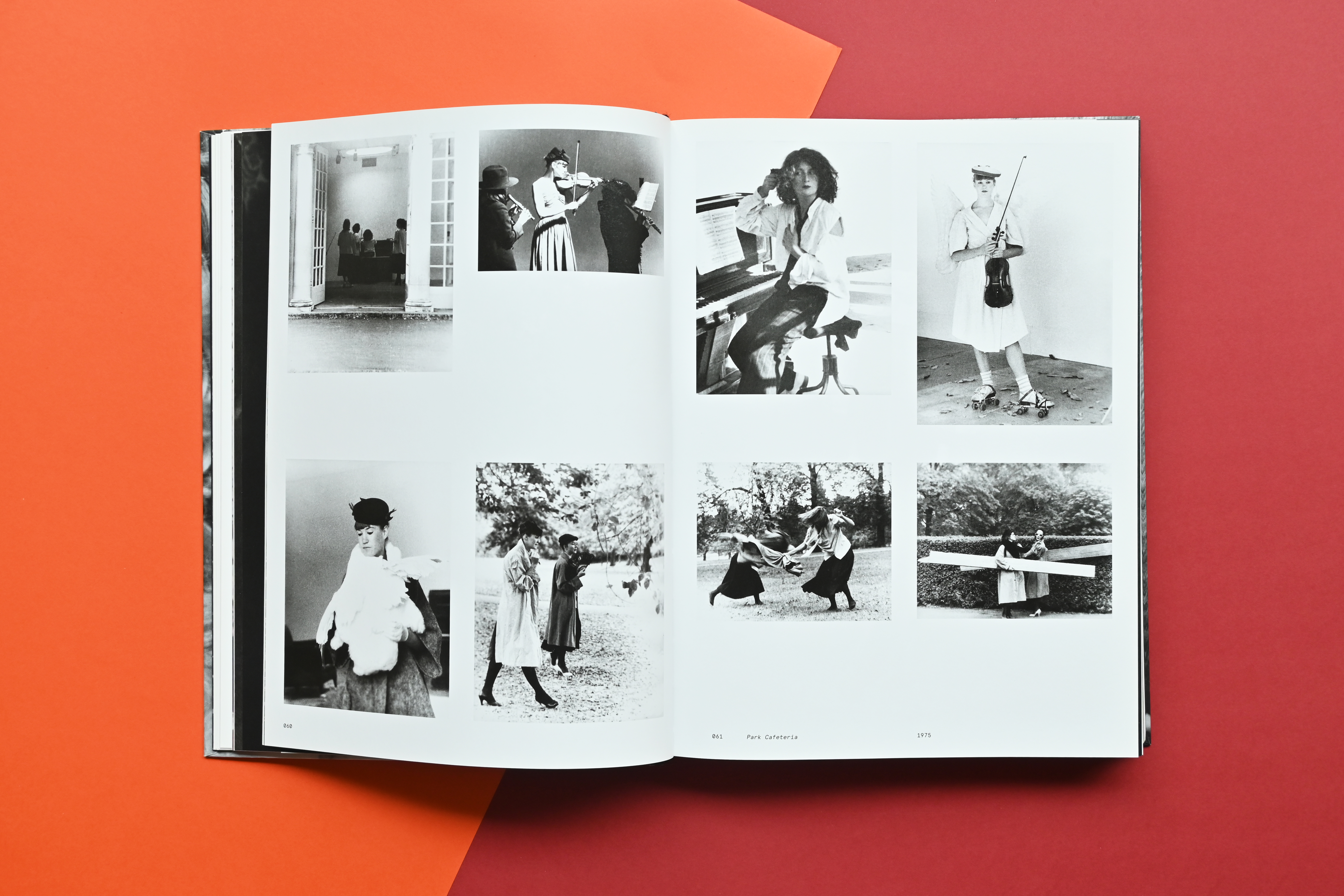
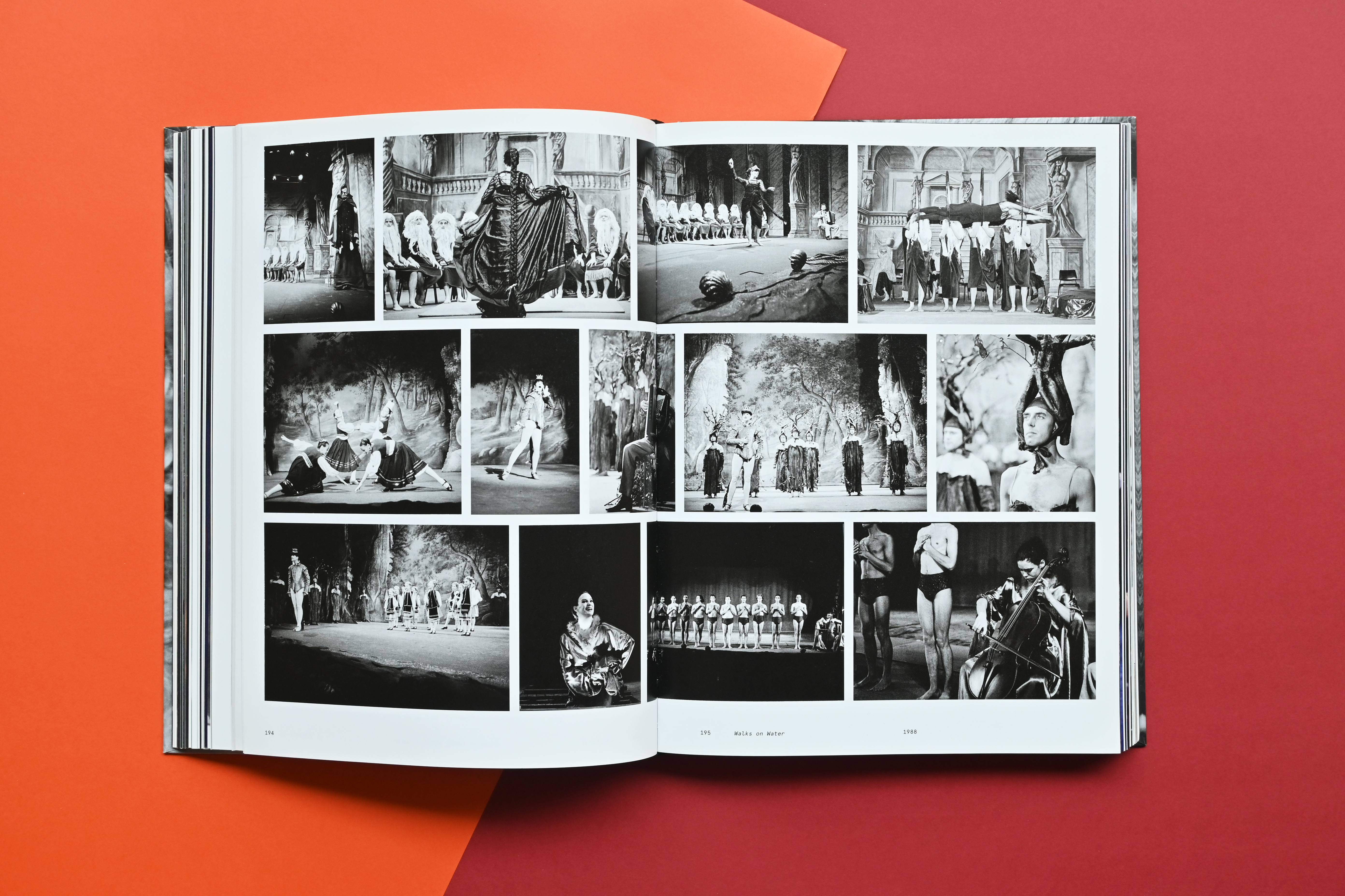
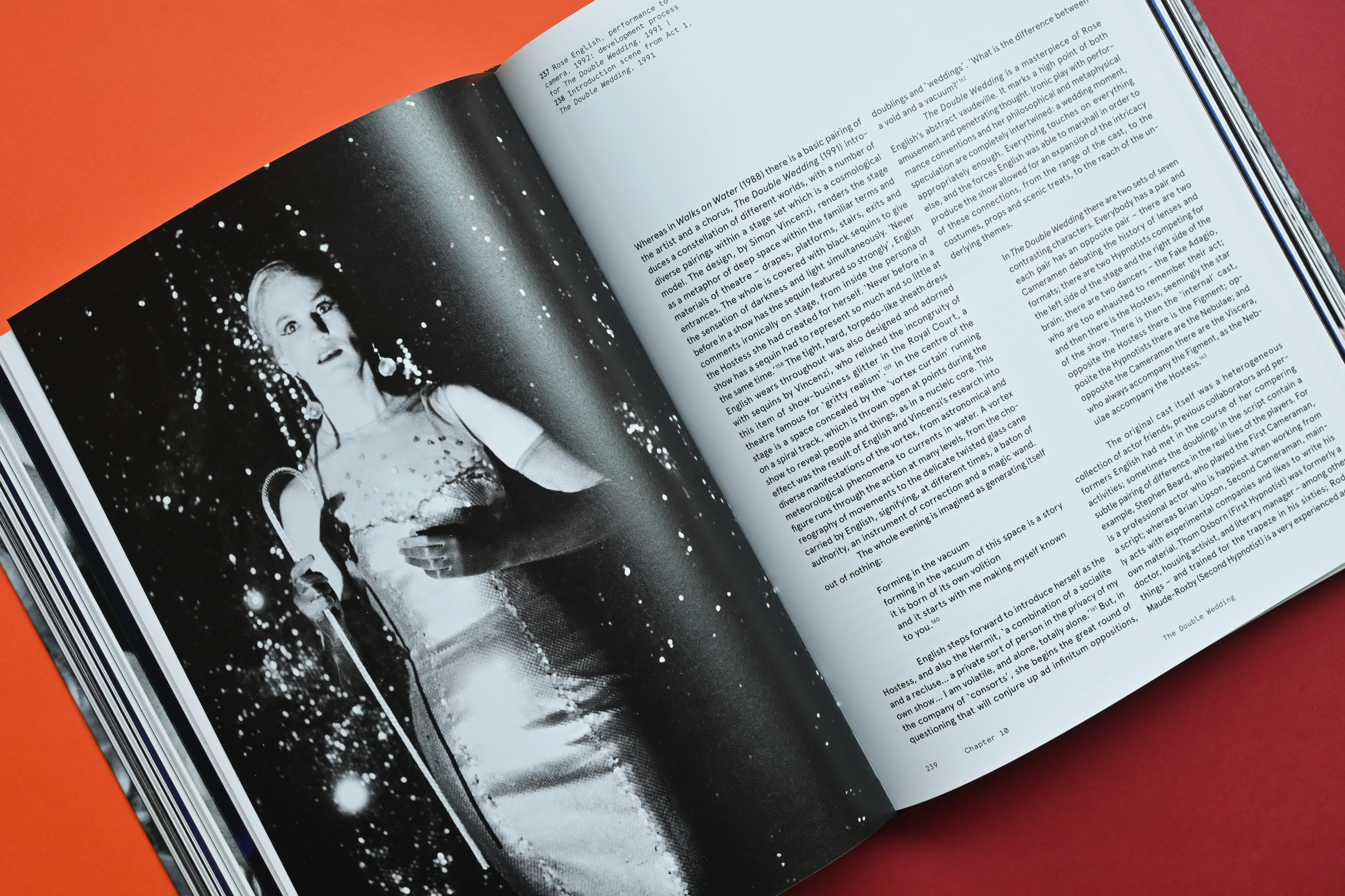
Each essay chapter is dotted with Rose’s research documents and gradually moves to pre-performance costume fittings, promotional photographs, etc. to end with the official photography from the performance(s) mentioned in the chapter. The included performance scripts are set in a different typeface and on pages that are cut shorter than the book block, like a ‘book in a book’.
Curating the massive 40-year archive of often analogue imagery was challenging, but it was all the more rewarding seeing the puzzle pieces come together. It was a great collaboration with the artist, but it also gave a sense of authorship over the project because she was given so much creative freedom and trust.
This was Sarah’s first project as an independent book designer, and she was approached by the book’s editor to tackle the challenge of intertwining the extensive essay with the many hundreds of archival photographs, research documents, behind the scenes shots, scripts and interviews, as well as lead the production management.
Each essay chapter is dotted with Rose’s research documents and gradually moves to pre-performance costume fittings, promotional photographs, etc. to end with the official photography from the performance(s) mentioned in the chapter. The included performance scripts are set in a different typeface and on pages that are cut shorter than the book block, like a ‘book in a book’.
Curating the massive 40-year archive of often analogue imagery was challenging, but it was all the more rewarding seeing the puzzle pieces come together. It was a great collaboration with the artist, but it also gave a sense of authorship over the project because she was given so much creative freedom and trust.


Do you want to know more about this subject or are you interested in collaborating on a project that could benefit from a content-driven approach? Contact us!