WHEN A BOOK BECOMES AN OBJECT
‘Don’t judge a book by its cover’. But – in the literal sense of the proverb – we all do, right? As book designers, we also judge a book by its physicality, its tactility, its ‘objectness’. The size, weight, binding, paper, typography, printing, even barcode placement. Sometimes we buy a book just because we love it so much as an object. When we seek inspiration for a new project, we will take it off the shelf and admire it all over again.
We design books with all those factors in mind. What cover and cover material best suits the subject and content? What do you experience when you pick it up: is it light or heavy? Can we add details that elevate the design or that convey an abstract idea?
In this case study, we highlight a few books that we designed and are proud of as objects in themselves.
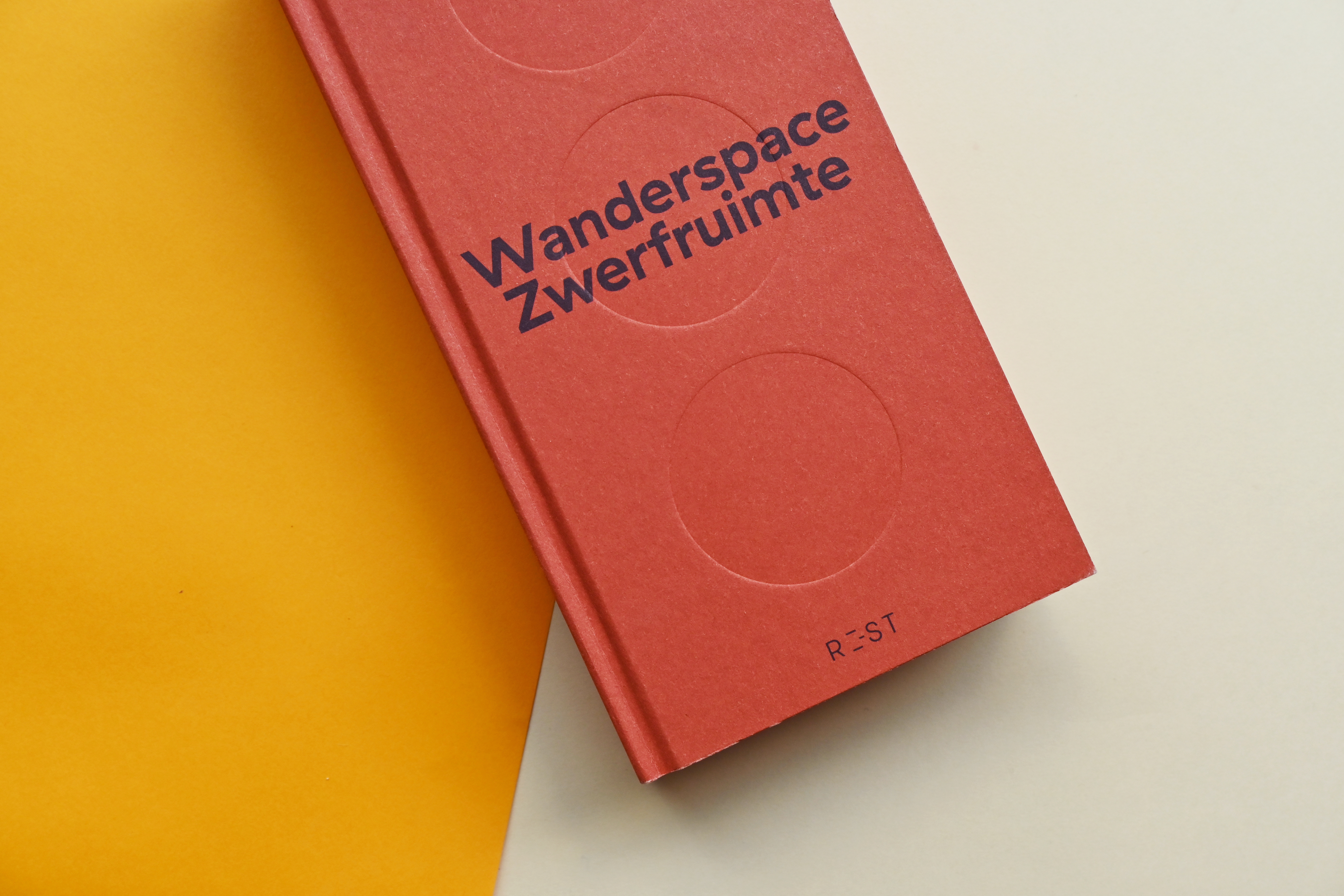
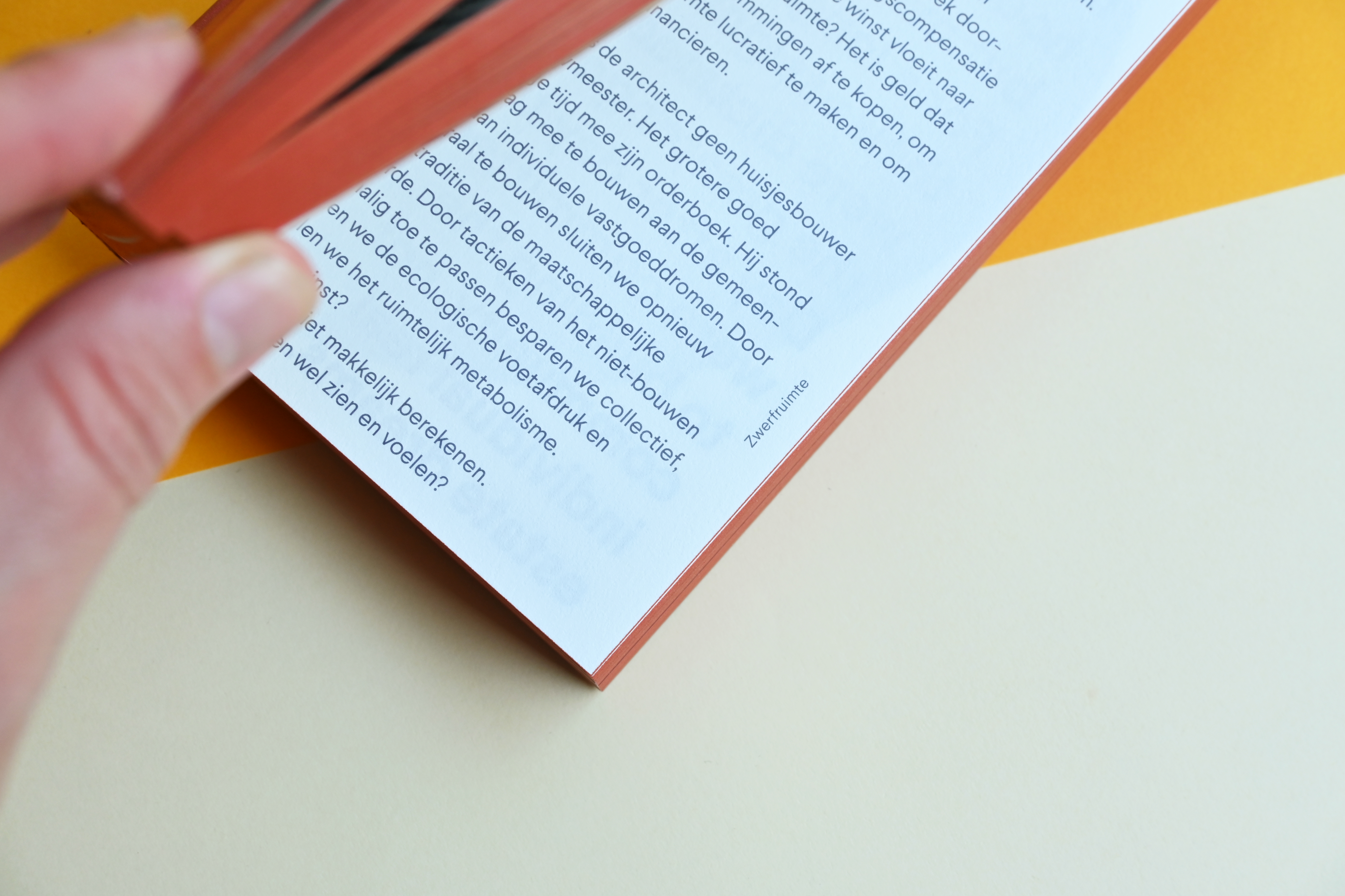
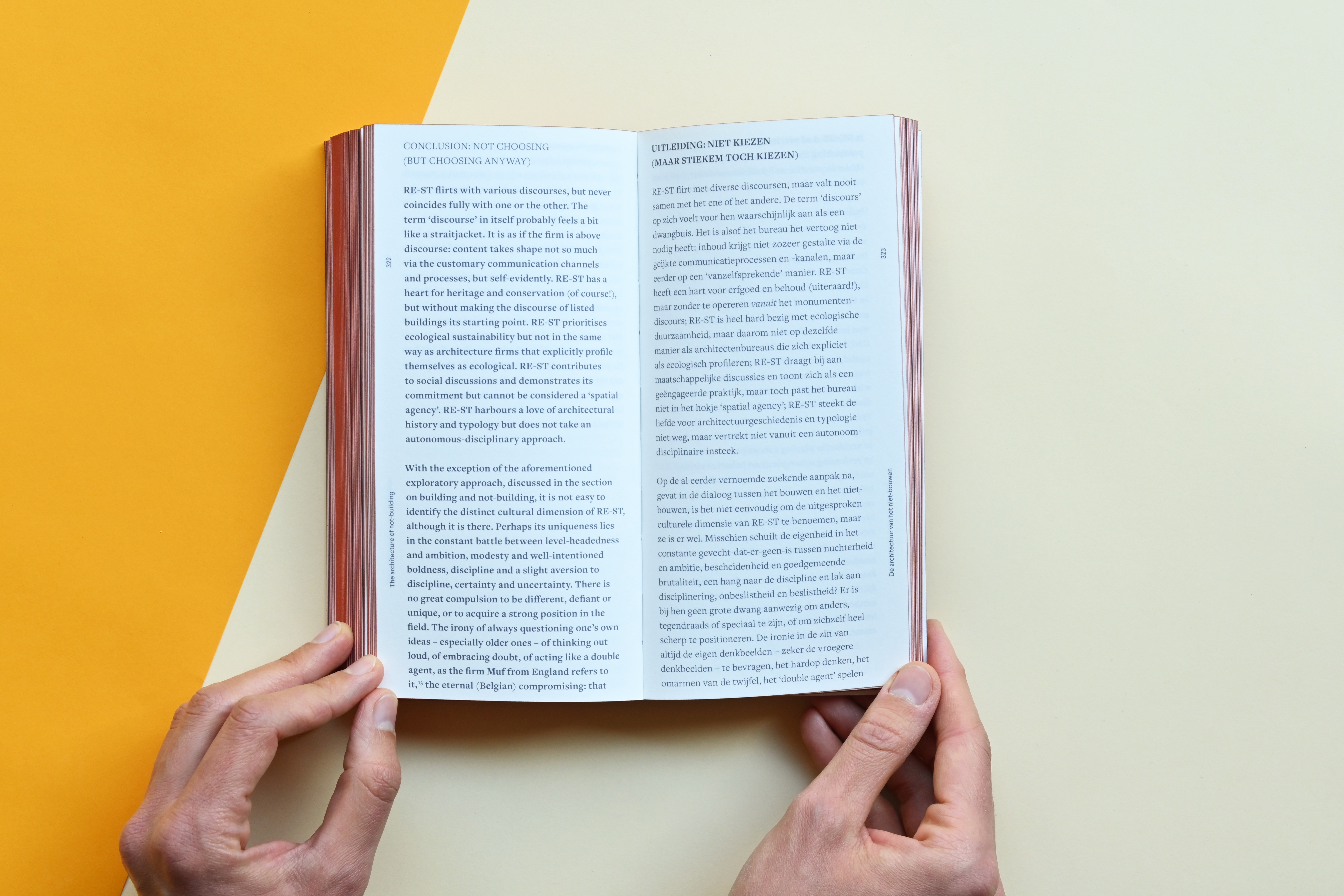
WANDERSPACE/ZWERFRUIMTE is a brick-sized book by Belgian architecture firm RE-ST. For their 10-year anniversary, they compiled this manifesto as a reflection of their ‘not-building’ practice. The form of the book refers to a 1979 artwork by Belgian artist/architect Luc Deleu called The last stone of Belgium, protesting against the unnecessary building culture. This book wants to be the last ‘brick’ laid down in Belgium, before every last bit of open space is developed into apartments or offices.
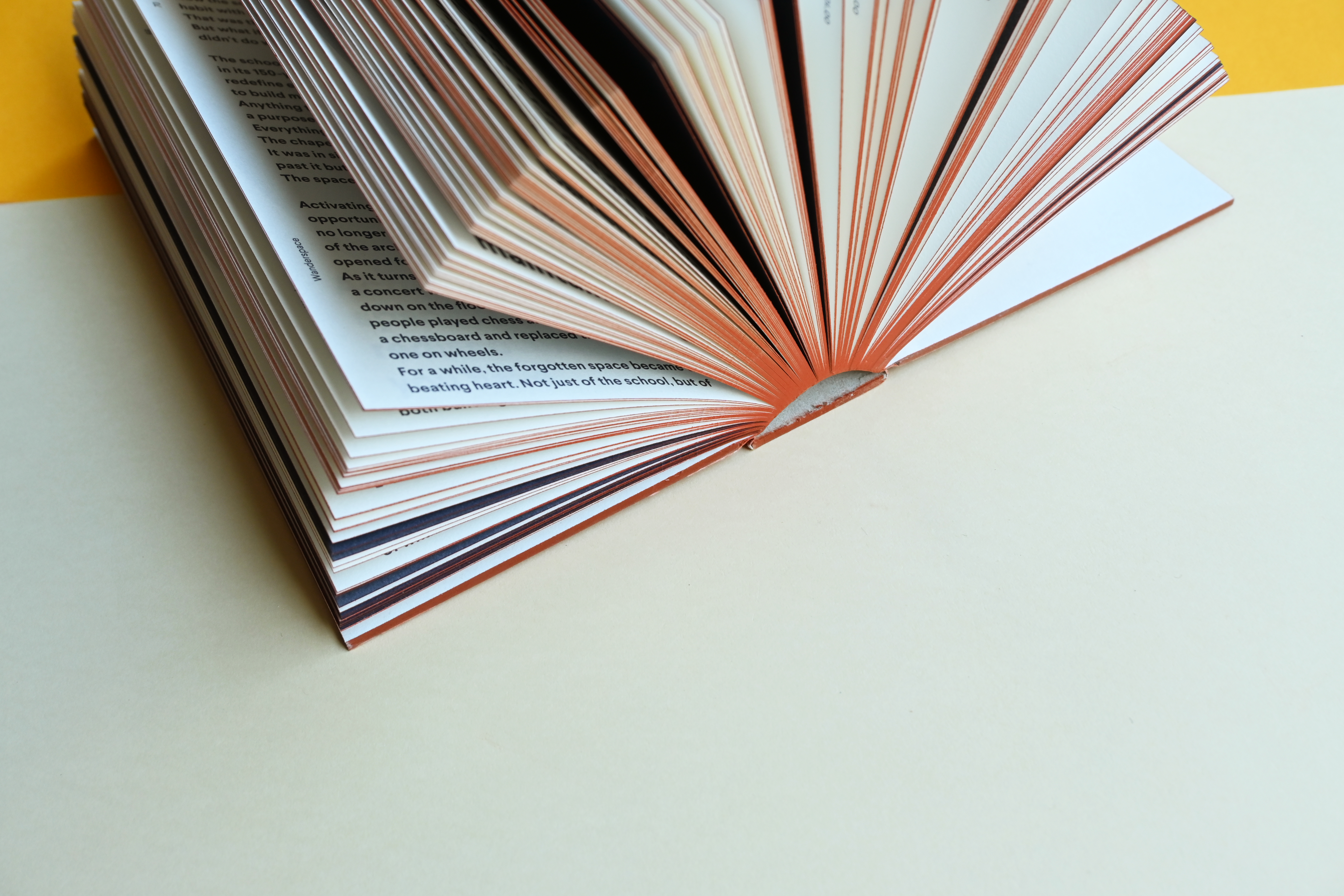
Our challenge was to design and produce the concept that RE-ST had in mind. We knew that we wanted it to be the size of a common terracotta brick: 11cm wide and 21cm high. The thickness ideally was around 4–5cm. We requested multiple quotes and received a couple of dummies. The idea of an open spine book in three sections, by Brepols, was our absolute favourite, but due to budget reasons the publisher decided to go with a more standard hardcover with a thickness of 3,5cm. To provide some contrast with the format, we chose bulky paper to create a counterintuitive light book rather than a heavy one.
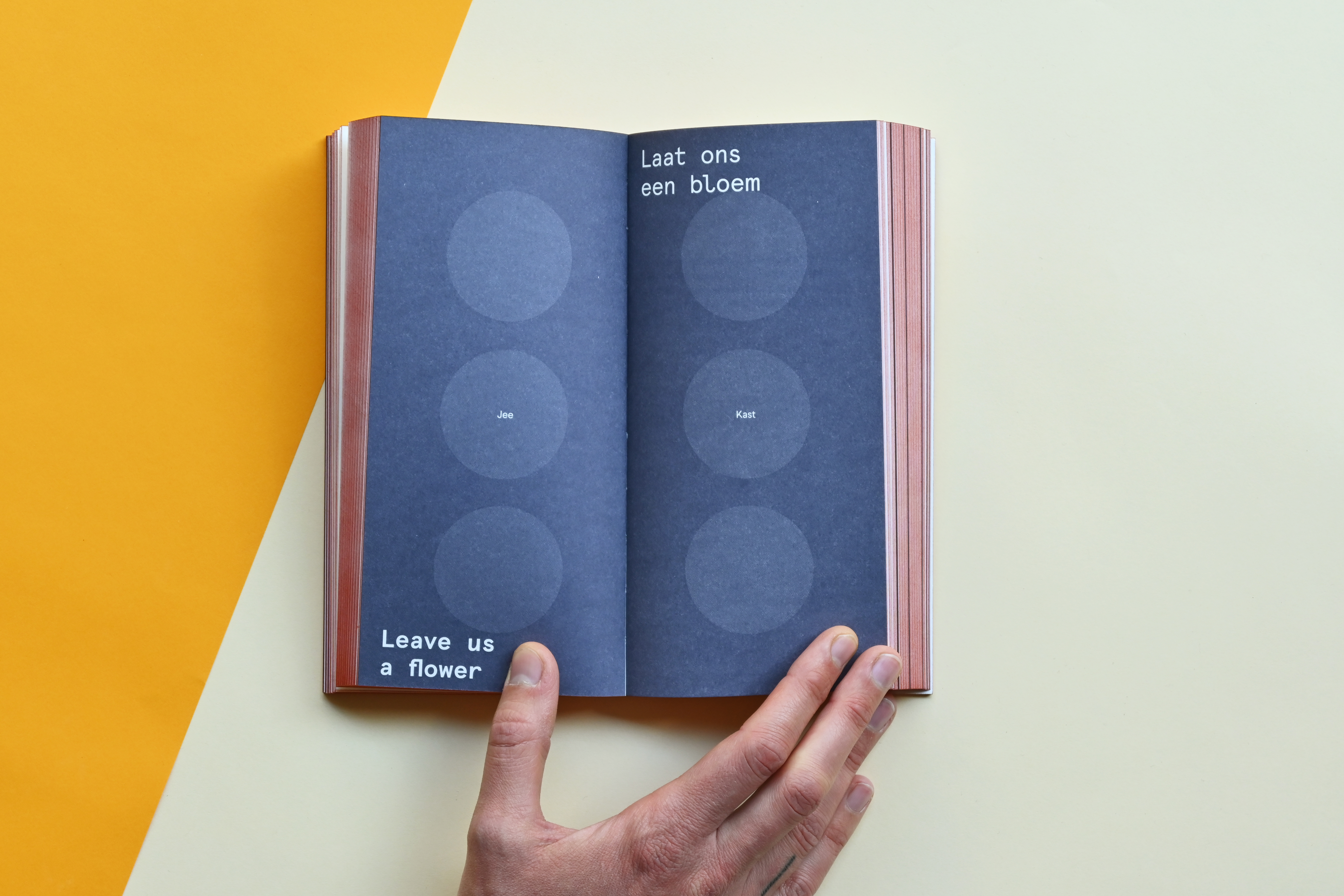
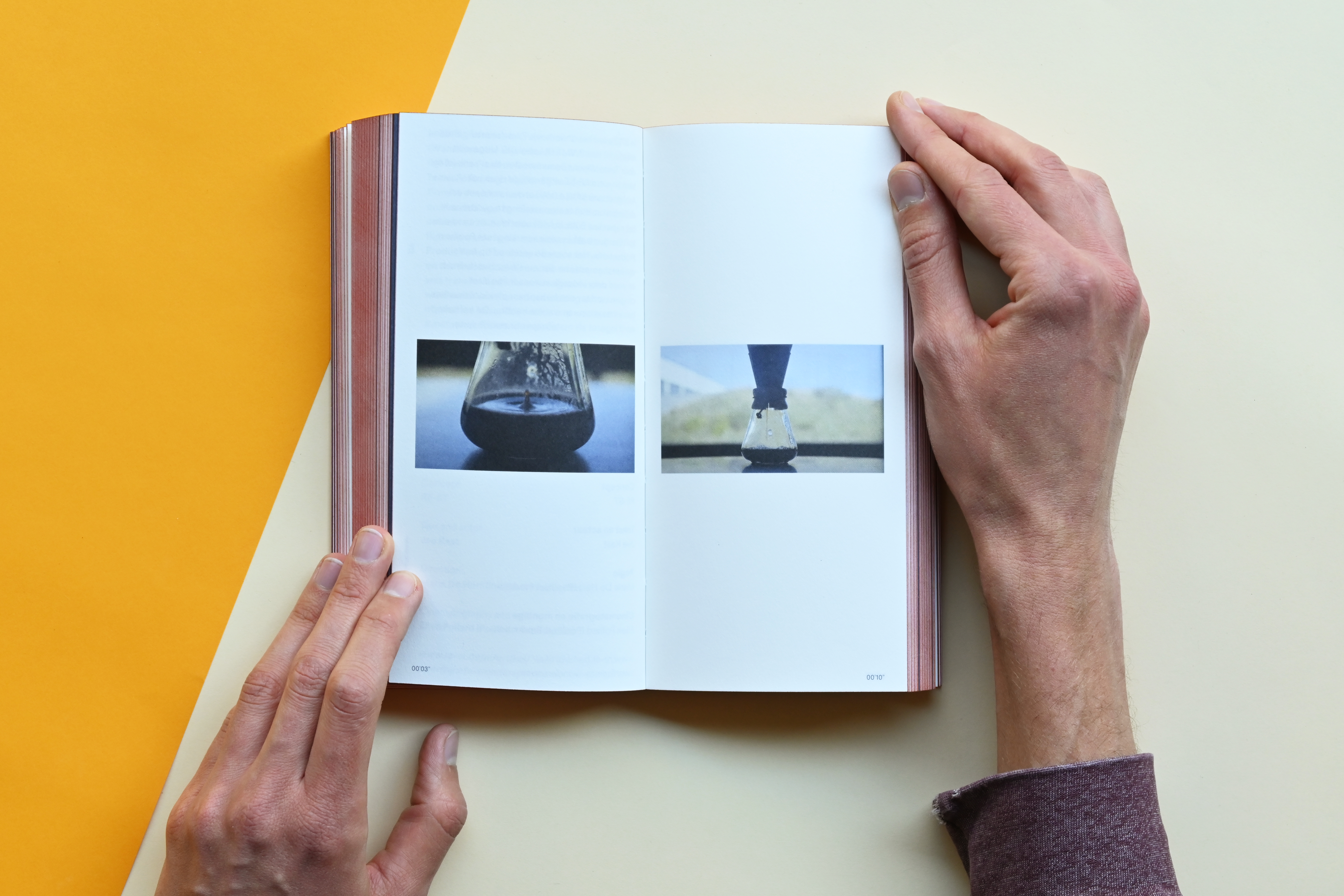
The 2mm hardcover board is cut flush and has edge printing in the same rusty PMS that is used to print the cover. A second, blue-gray PMS is added for the typographic layer and there are three circles blind embossed into the front and back cover, a clear nod to the design of a particular brick. The blue-gray is also used as the only colour for the interior, apart from the 48-page full-colour image section in the middle.
Our challenge was to design and produce the concept that RE-ST had in mind. We knew that we wanted it to be the size of a common terracotta brick: 11cm wide and 21cm high. The thickness ideally was around 4–5cm. We requested multiple quotes and received a couple of dummies. The idea of an open spine book in three sections, by Brepols, was our absolute favourite, but due to budget reasons the publisher decided to go with a more standard hardcover with a thickness of 3,5cm. To provide some contrast with the format, we chose bulky paper to create a counterintuitive light book rather than a heavy one.
The 2mm hardcover board is cut flush and has edge printing in the same rusty PMS that is used to print the cover. A second, blue-gray PMS is added for the typographic layer and there are three circles blind embossed into the front and back cover, a clear nod to the design of a particular brick. The blue-gray is also used as the only colour for the interior, apart from the 48-page full-colour image section in the middle.
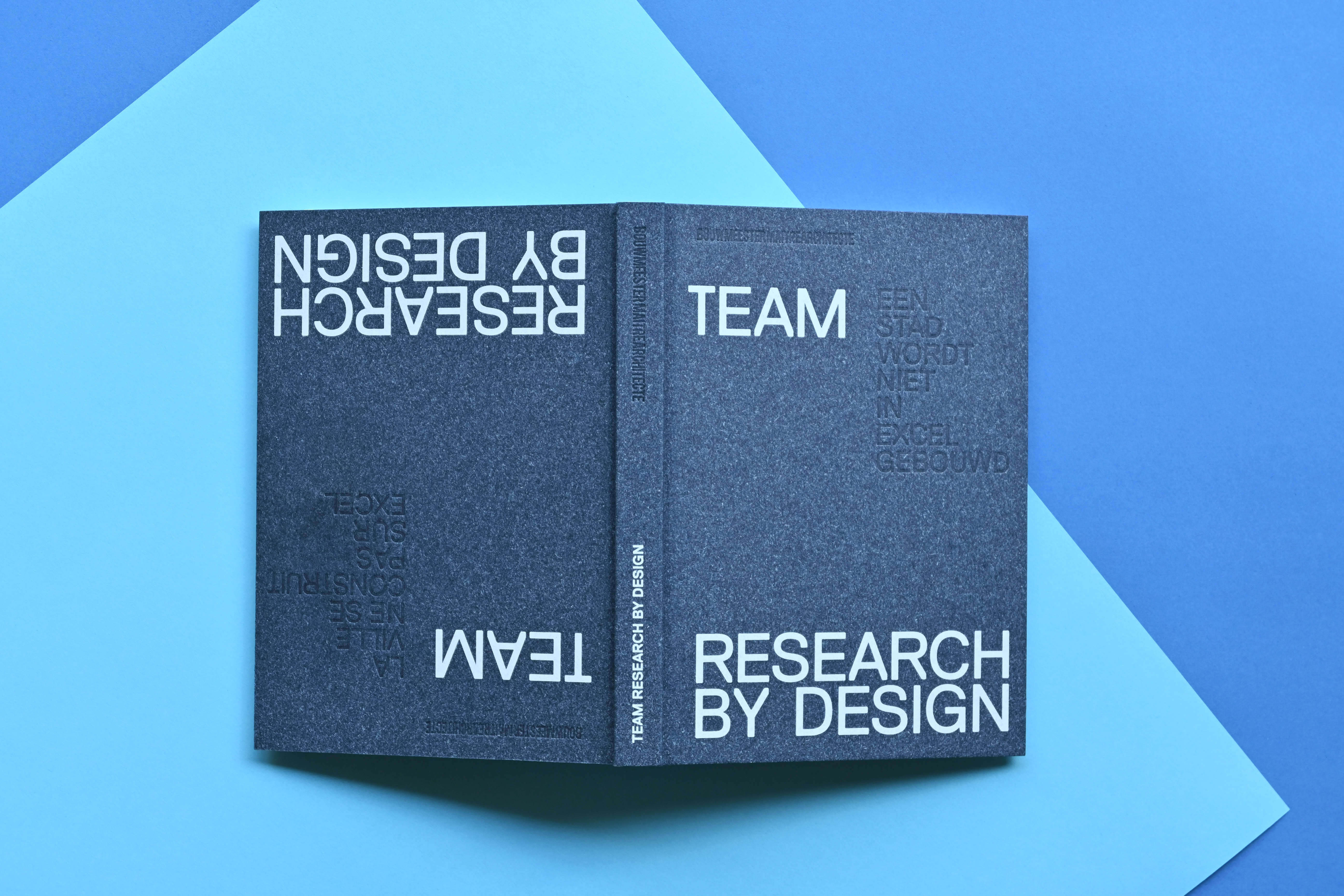
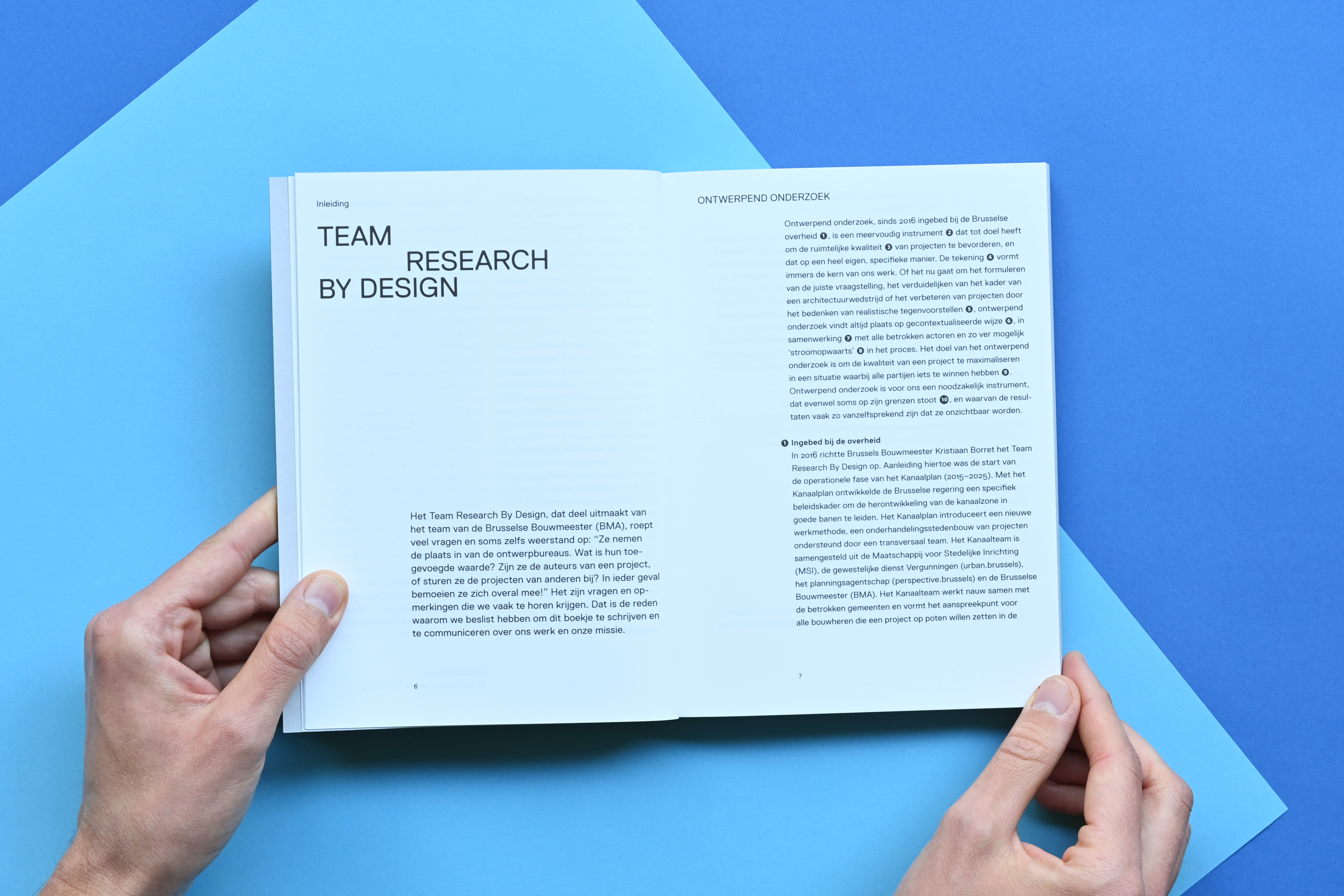
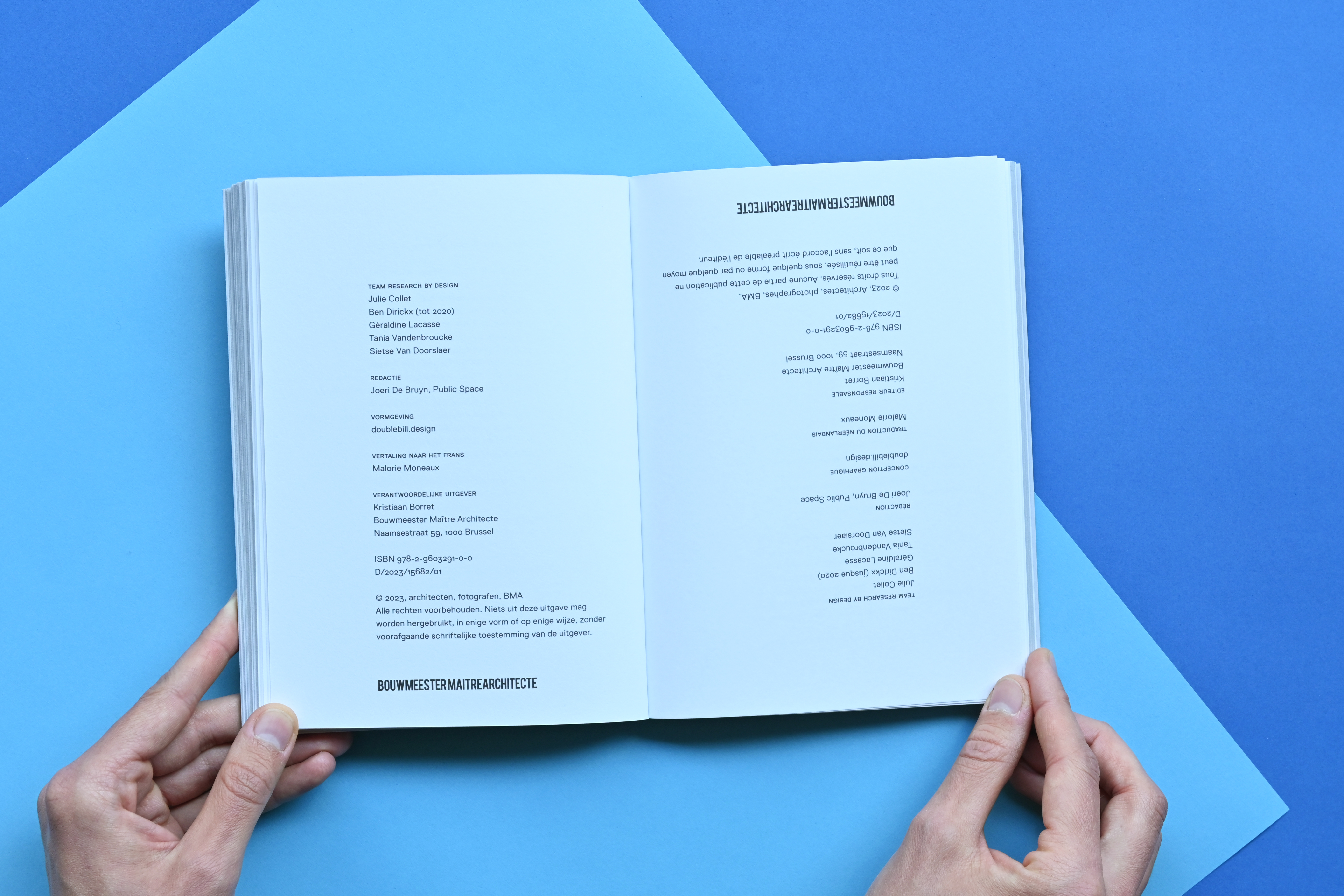
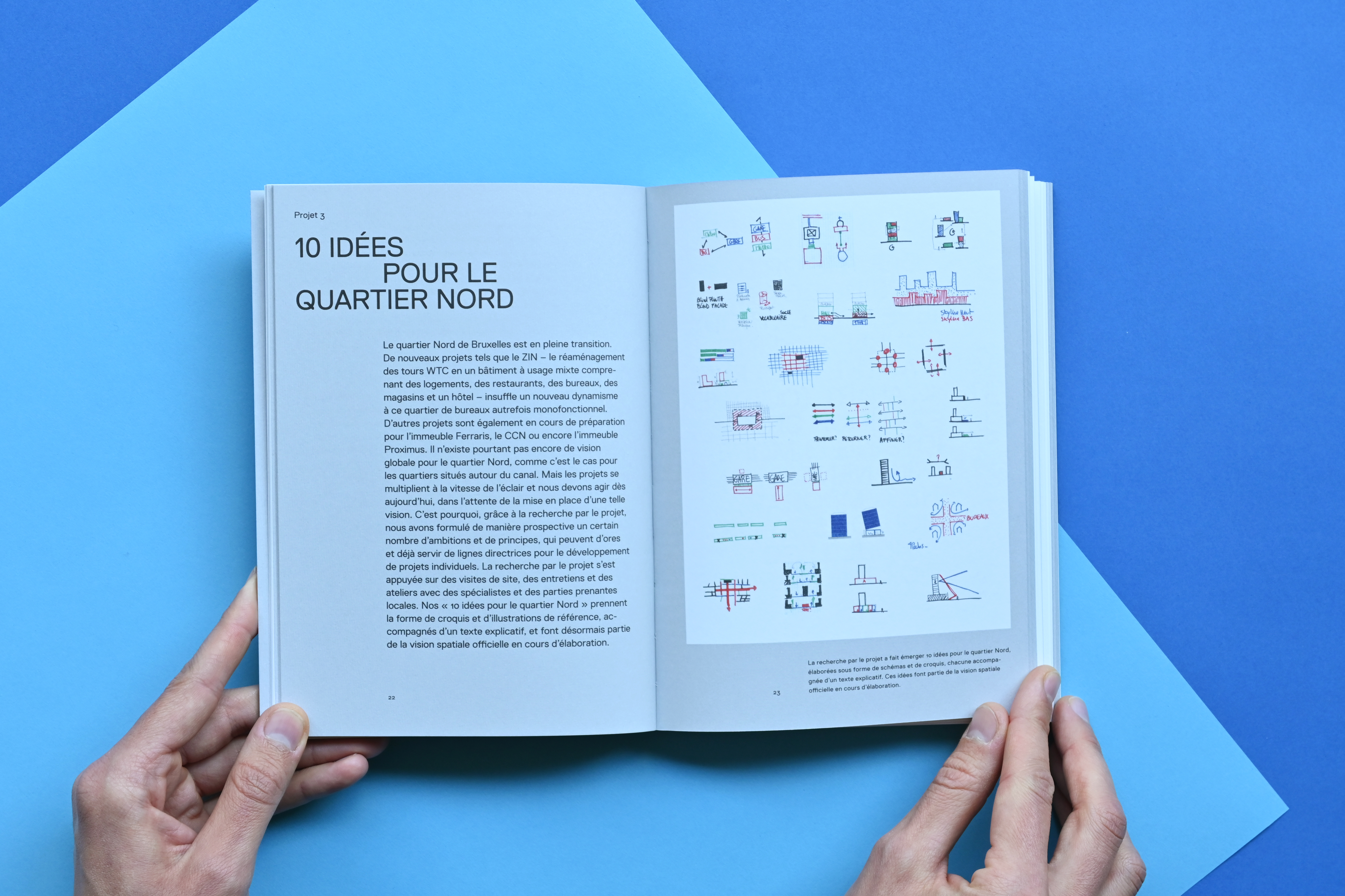
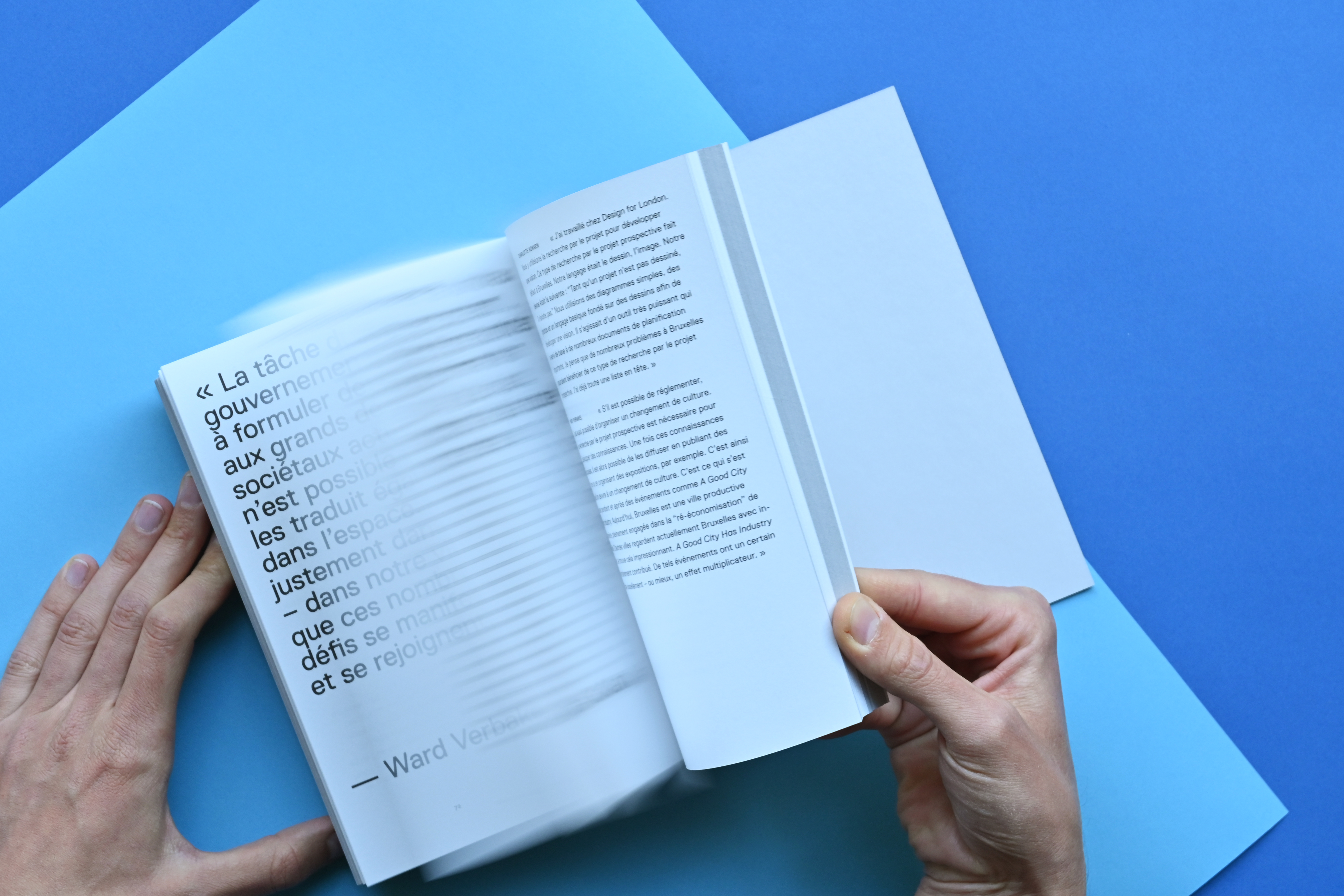
TEAM RESEARCH BY DESIGN is a new publication by the Bouwmeester Maître Architecte, the chief government architect of the city of Brussels. It explains the concept of ‘research by design’: a method to provide arguments early on in the political decision-making process about what a city will look like and what level of quality is desired. This is done through the medium of drawing; not to be executed as such, but to feed the conversation about the spatial qualities and possibilities, and hopefully also to influence the final decisions made.
The bilingual publication is produced as a ‘tête-bêche’: Dutch on one side and French on the other side.
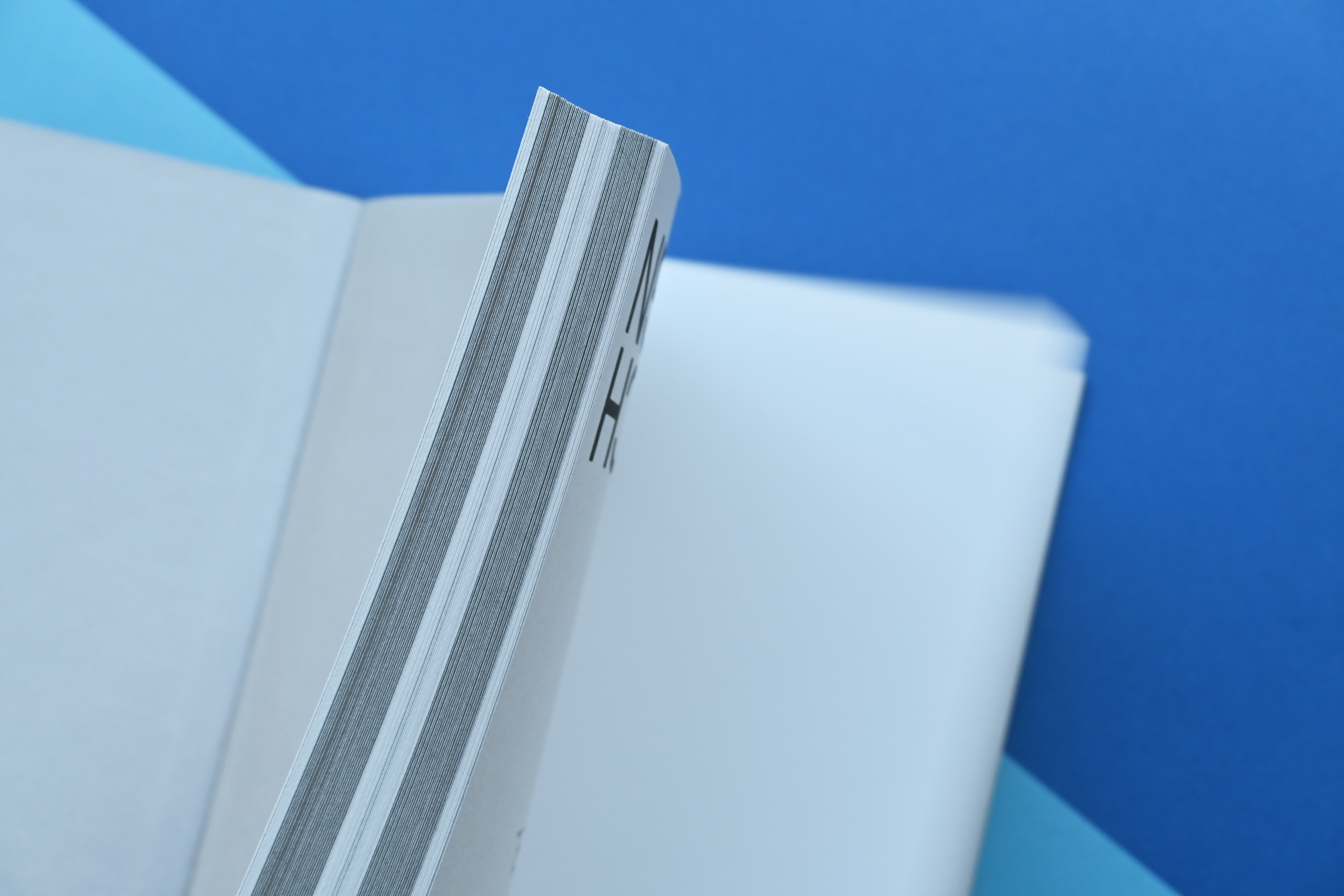
For the cover material we chose Napura Khepera, a thermo-reactive paper with lovely speckles and fibres. One layer of the typographic title treatment is blind embossed, which means it is impressed without the use of inks or foils. The darker blue colour is achieved because of the paper’s reaction to the heat from the embossing. The other layer of the typography is screenprinted in a light grey Pantone colour. The 2mm hardcover is cut flush, exposing the greyboard.
Grey is also used in the interior of the book to separate the content into parts: the front and end matter are set on white backgrounds, but the projects – located in the centre of each side – are set on a light grey background. This makes the project section stand out. The interior paper is a beautiful Munken Lynx Rough, a pleasure to touch.
The bilingual publication is produced as a ‘tête-bêche’: Dutch on one side and French on the other side.
For the cover material we chose Napura Khepera, a thermo-reactive paper with lovely speckles and fibres. One layer of the typographic title treatment is blind embossed, which means it is impressed without the use of inks or foils. The darker blue colour is achieved because of the paper’s reaction to the heat from the embossing. The other layer of the typography is screenprinted in a light grey Pantone colour. The 2mm hardcover is cut flush, exposing the greyboard.
Grey is also used in the interior of the book to separate the content into parts: the front and end matter are set on white backgrounds, but the projects – located in the centre of each side – are set on a light grey background. This makes the project section stand out. The interior paper is a beautiful Munken Lynx Rough, a pleasure to touch.

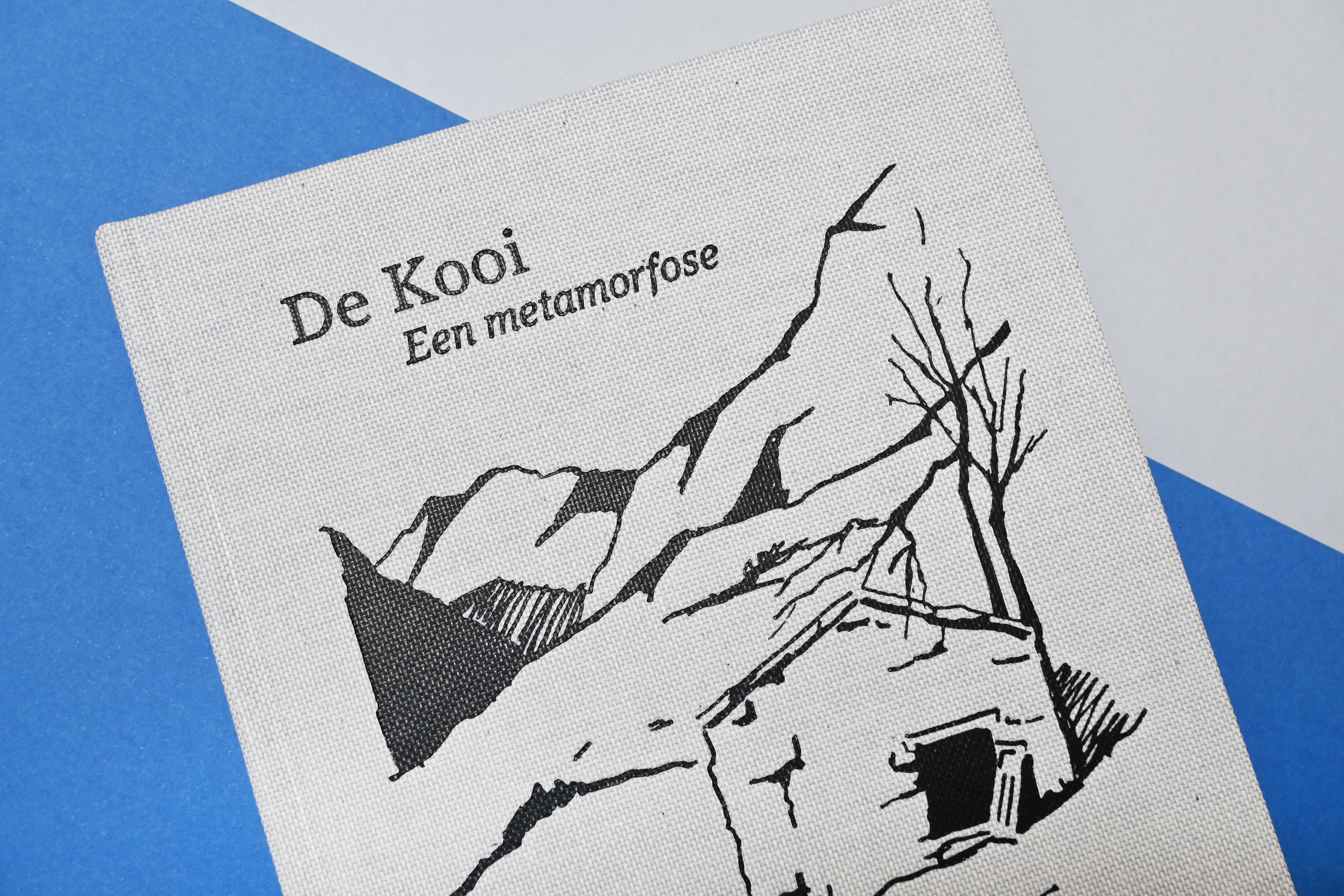
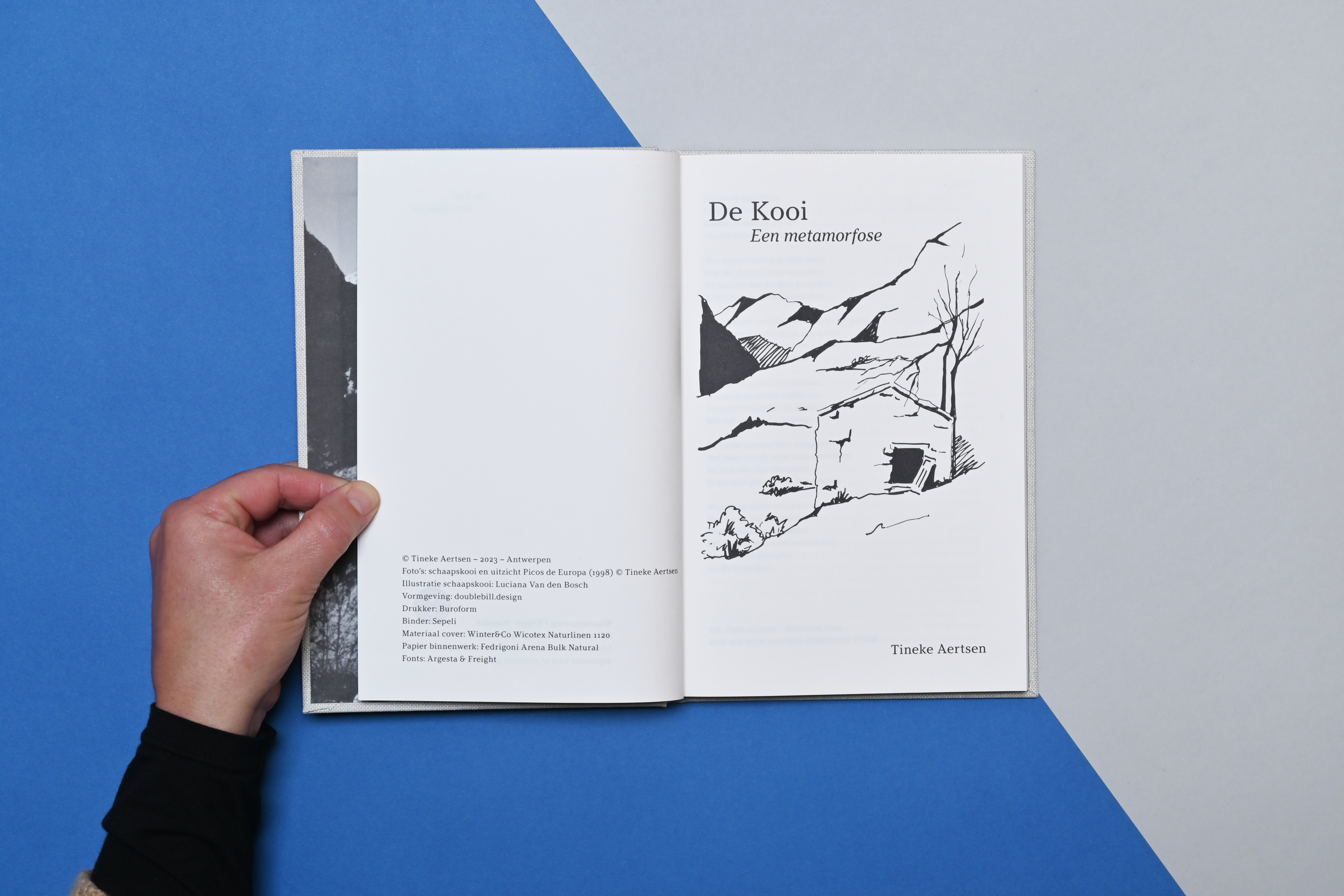
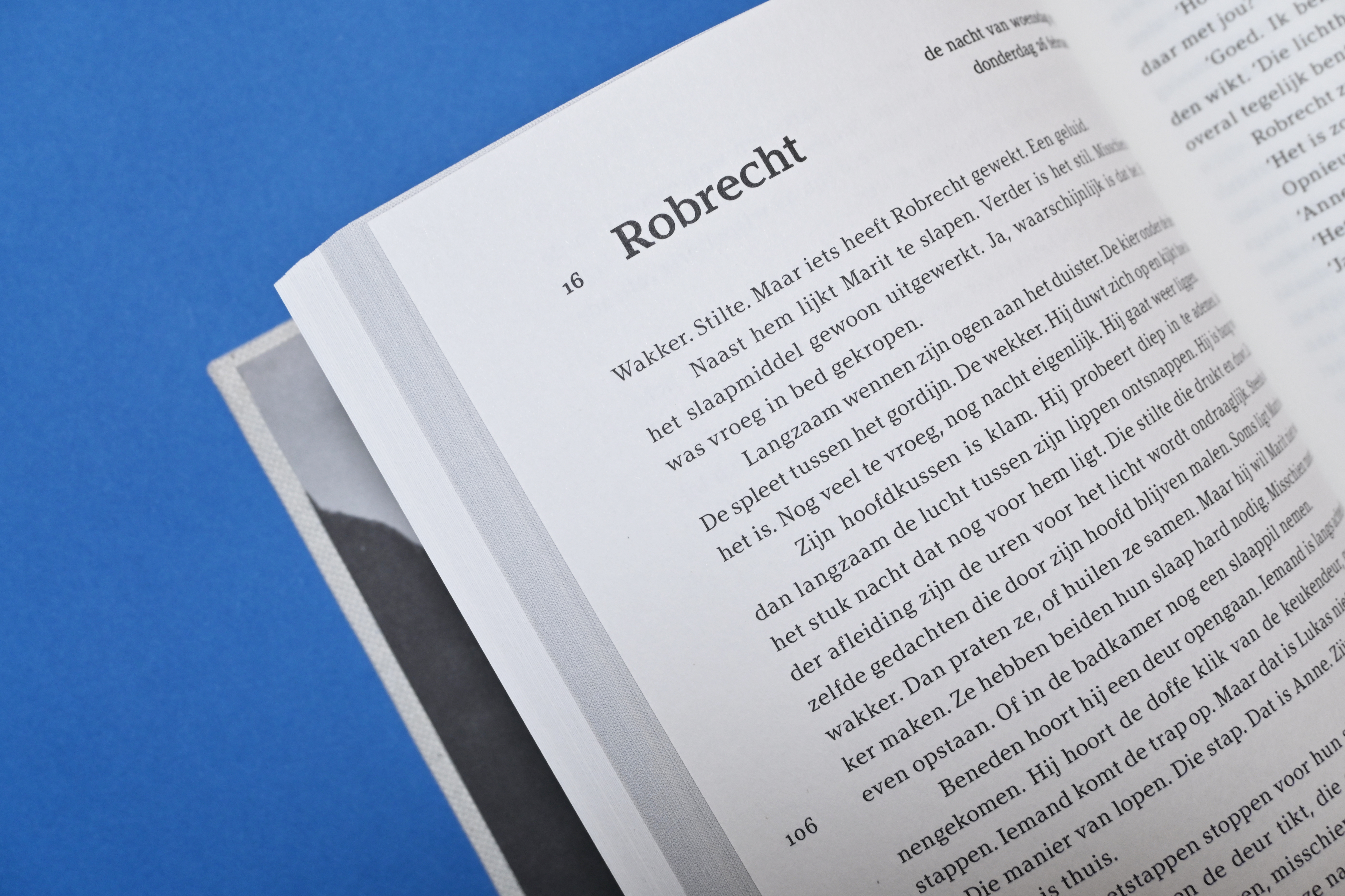
DE KOOI is the self-published novella by Tineke Aertsen. Its look takes inspiration from a Bur-O-Class Aurora notebook: the same dimensions, a natural grey-ish linen cover with foil printing. But we changed some details to make it more fitting for a work of fiction: bulky paper, printed endpapers, thicker board for the cover. Unfortunately we weren’t able to do the signature red edge printing because of budget restrictions.
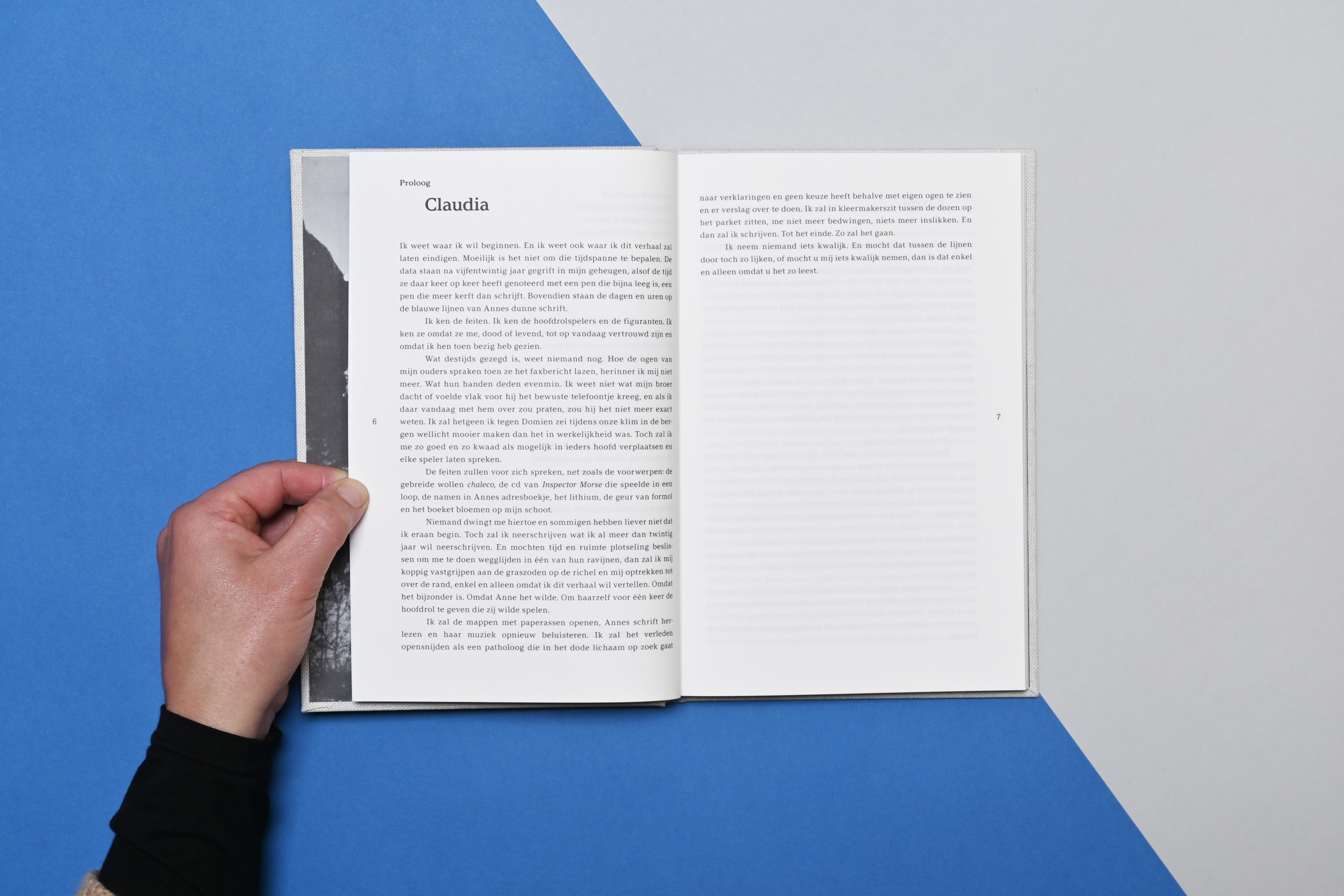
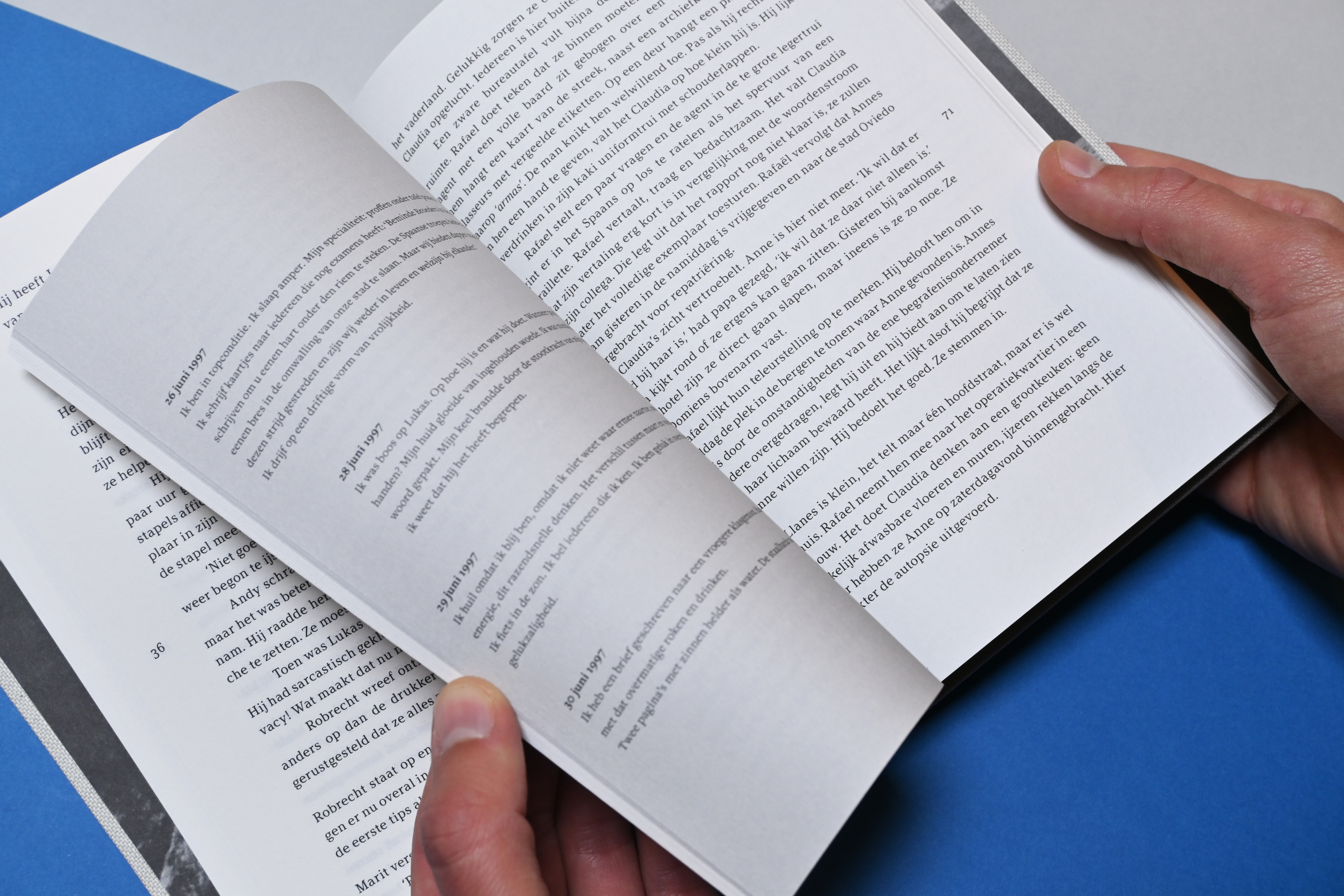
In certain chapters of this fictional story (which is based on true facts), fragments from a diary are shown next to the prose. This is because the main character, Anna, writes in a Bur-O-Class notebook during an important trip. As the reader, it’s confusing and you must choose whether you want to read them simultaneously or in separate readings. It makes you reflect on the difference between reality and fiction.
The hotfoil printing on the cover is in anthracite, not black: this brings some softness to the overall look. For the cover material we picked Wicotex Naturlinen, this is a near exact match to the notebook’s linen. For the interior, printed in offset black, we chose Fedrigoni Arena Bulk Natural. The book was produced in a small batch of 200 copies.
Do you want to know more about this or are you interested in collaborating on a project that needs a tactile outcome? Contact us!