Year: 2025
Publisher: Vlaams Architectuurinstituut (VAi)
Editors: Benoît Vandevoort, Sam Vanhee, Fredie Floré, Els De Vos & Tine Poot
Scope: book design & production
Printer: Die Keure
Binder: Van Mierlo
Foil printing: Finishing Touch
Thumb cuts: SchoPa
Format: 105×297mm
Pages: 272
︎︎︎ vai.be
Publisher: Vlaams Architectuurinstituut (VAi)
Editors: Benoît Vandevoort, Sam Vanhee, Fredie Floré, Els De Vos & Tine Poot
Scope: book design & production
Printer: Die Keure
Binder: Van Mierlo
Foil printing: Finishing Touch
Thumb cuts: SchoPa
Format: 105×297mm
Pages: 272
︎︎︎ vai.be
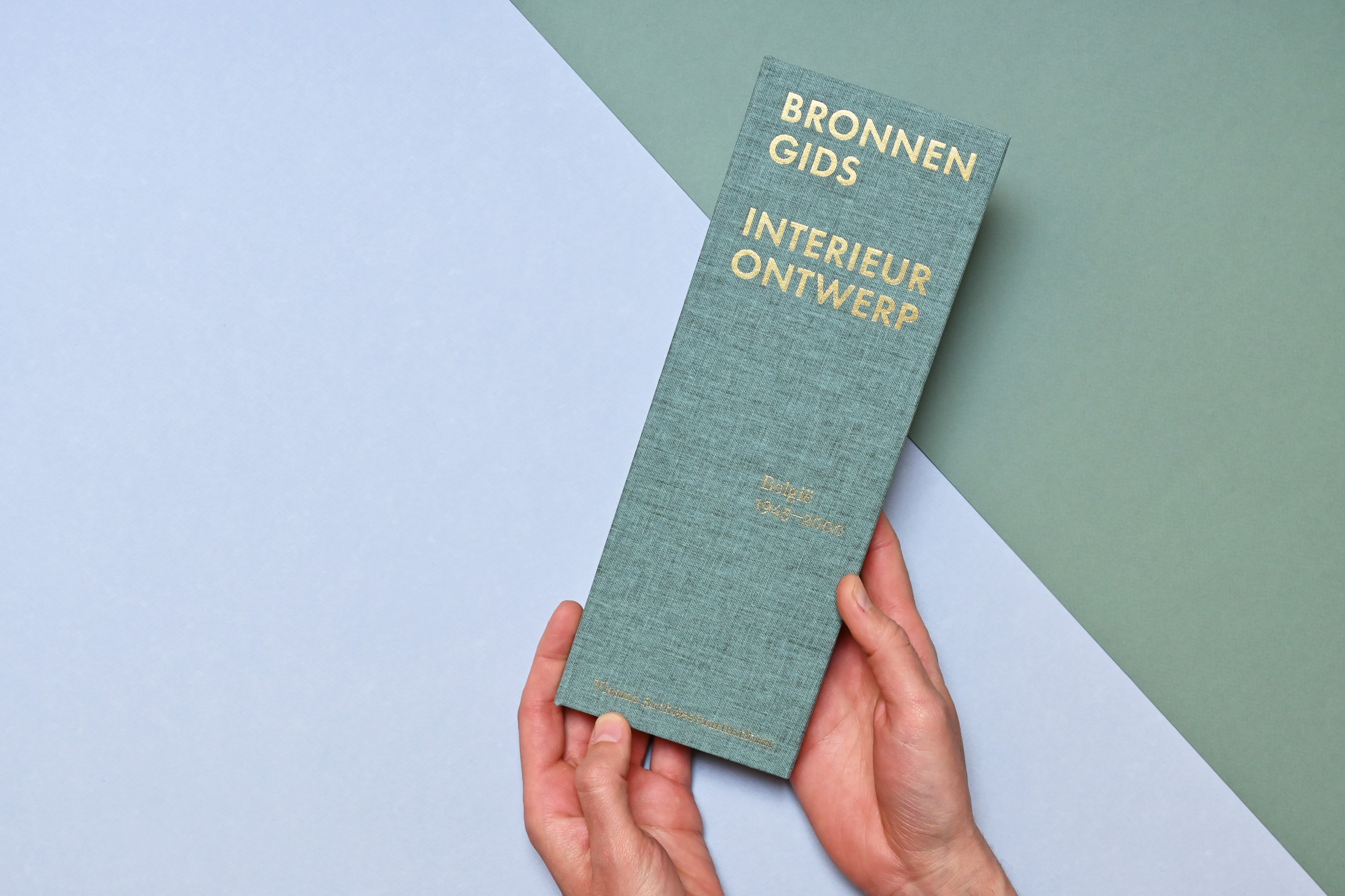
BRONNENGIDS INTERIEURONTWERP
BELGIË 1945–2000
This comprehensive and unique in-depth guide maps the rich field of Belgian interior design between 1945 and 2000. It’s not only an indispensable tool for students and researchers, but also an urgent call for the preservation of valuable archives.
Written and edited by doctoral researchers of the University of Antwerp and KU Leuven, together with publisher VAi, the book explores the sources that are essential to understand the evolution of interior design as an independent discipline in Belgium, offering the first in-depth insight into the field, focusing on the role of education, professional organisations and designers. It also zooms in on the internationally renowned Biennale Interieur and unique stories of less visible designers.

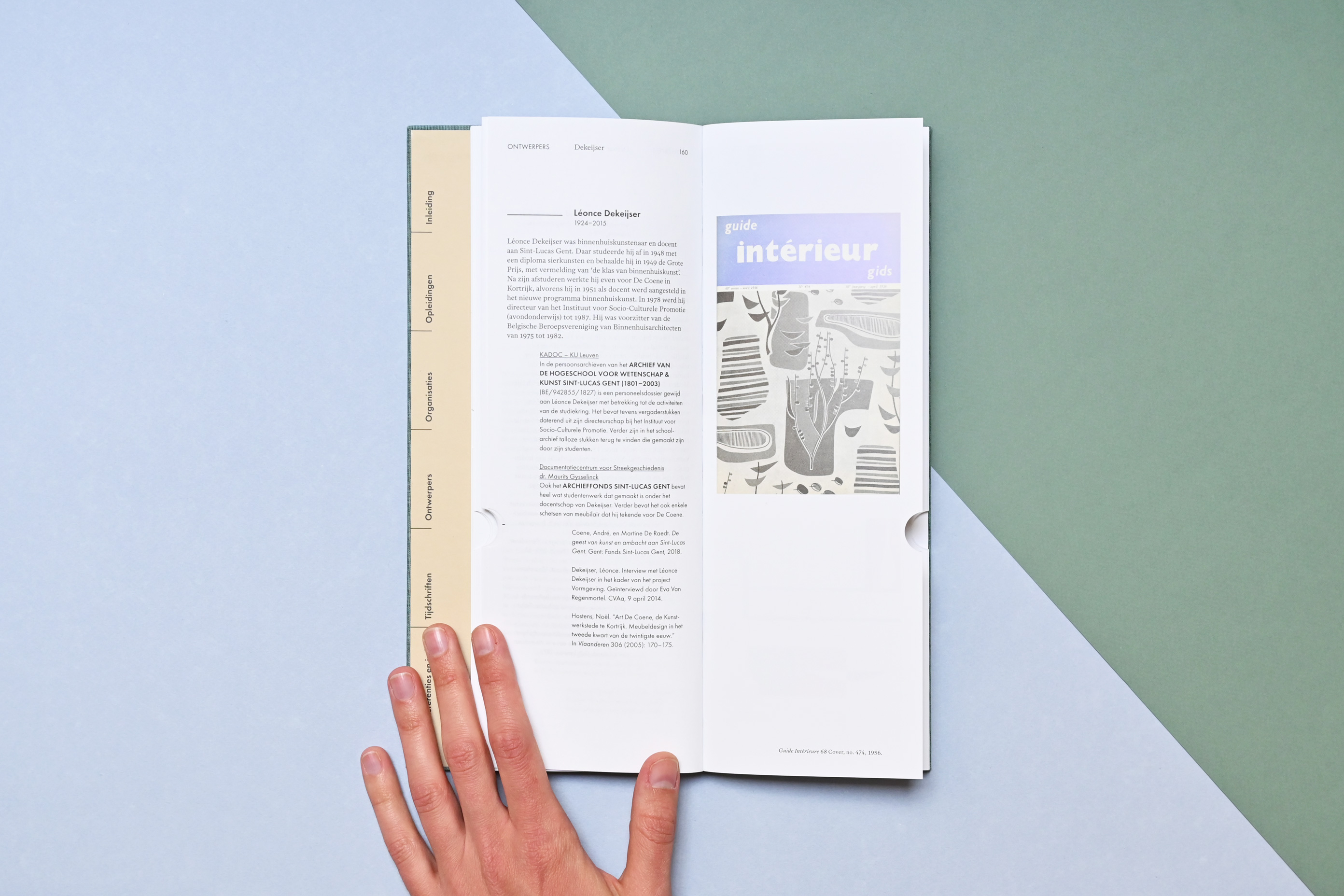
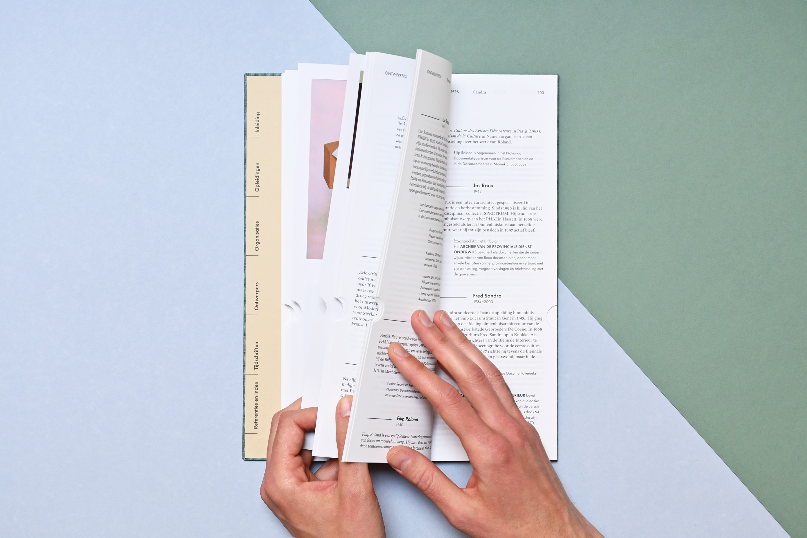
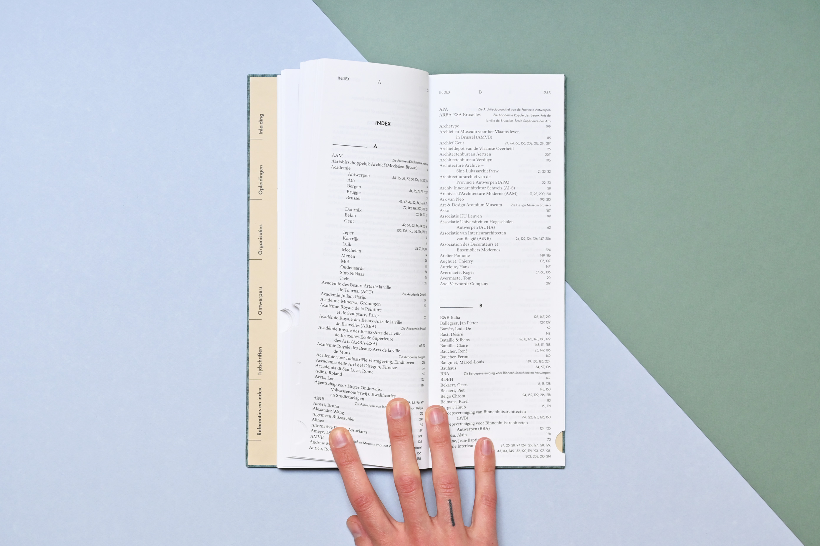
In this particular case, our book design prioritises legibility and usability. It’s a very text-rich publication, so a clear type hierarchy with header navigation, lemma highlights and various column widths were key elements. There is an extensive table of contents in the front, with handy thumb cuts for each major chapter in the book – making it easy to navigate.
We chose for a hardcover finish with Swiss binding and an open spine, to ensure that the book lays completely flat. An important feature when using a resource guide as a researcher: you want it to stay open on the page that you are reading while also writing something down.
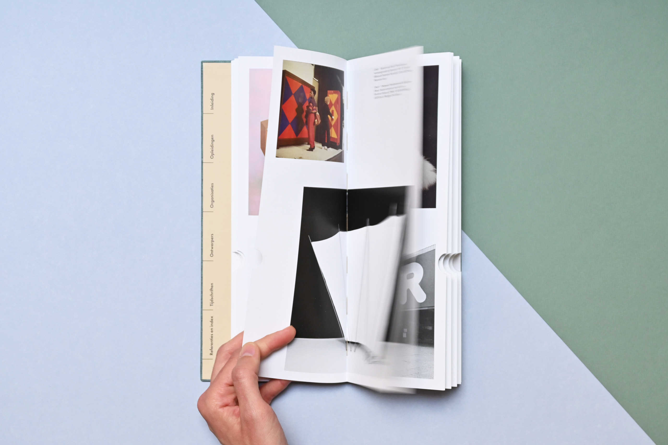
Aside from the black-and-white text pages, there is also a colour section on a coated paper with beautiful visual references from various archives.
The tall format, tactile materials and stand-out thumb cuts make the Bronnengids a book about design as well as a design object itself.